"Beauty is everywhere—you only have to look to see it."
Bob Ross
Though only one aspect of our aesthetic experiences, beauty has historically been one of the most important and contested (Shelley, 2017), and it is often the first characteristic people think of when they hear words like "design," "art," and "visual." Despite its ubiquitous use in our language and understanding, actually defining beauty and explaining what makes something beautiful can be quite difficult. We all use words like "beauty" and "beautiful" on a daily basis, but we often have difficulty articulating what they mean. Furthermore, two people might disagree on whether something is beautiful, and even if they both think the same thing is beautiful, they may not agree on why it is beautiful. Just as we might say that something is "salty" but not be able to explain what "saltiness" is, beauty is easily recognized on an implicit level but is poorly articulated in an explicit manner.
At a basic level, if something is beautiful, then this implies that we have a positive or pleasing emotional response to it. Beautiful music might make us feel peaceful, a beautiful movie might make tears of joy well up in our eyes, and a beautiful painting might inspire a sense of euphoria or enlightenment in us. Thus, beauty relies on a stimulus-response relationship between an object and our consciousness, and if a stimulating object leads to a positive emotional response, then we ascribe beauty to the object.
However, because stimuli do not always impact people in the exact same way, philosophers have long debated whether beauty has any reality in objects themselves (e.g., by conforming to certain metaphysical realities, such as Plato, Aristotle, and others believed) or is "merely in the mind which contemplates them" with "each mind perceiv[ing] a different beauty" (Hume, 1757). This latter subjective stance is relativistic in the sense that it relies upon the personal, cultural, and perspectival experience of the observer; but many have nonetheless argued that intersubjective standards of beauty can develop over time as "the long-run consensus of people who are in a good position to judge functions analogously to an objective standard" (Sartwell, 2016). That is, even if things are not beautiful in-and-of themselves, over time people develop consensual attitudes about their beauty that can be accepted as semi-certain (and not purely subjective).
Furthermore, the concept of beauty is philosophically interesting because unlike other perception-inducing experiences in the world, we ascribe beauty to the object itself. For instance, though a fast-food sign might make us feel hungry, we do not say that the sign itself is hungry; yet, if an image invokes pleasure within us, we say that it (the object) is beautiful. For these and other reasons, modern philosophers argue that beauty is an outward-facing celebration of the world wherein "subject and object are juxtaposed and connected," also inviting us to enjoy further experiences, to share, and to connect with others on a social level (Sartwell, 2016).
Visual Beauty in Learning Design
Applying these ideas to visuals in learning design, we should recognize a few helpful principles.
First, though the perception of beauty will always have some subjectivity associated with it, objects can be considered beautiful as they elicit positive reactions in more and more people over time, meaning that as we study how people react to our designs, we can confidently come to say whether they are beautiful or not based on how people are reacting to them.
Consider the screenshots of two websites below, and ask yourself "Which is more beautiful?"
Figure 1
Two Example Websites of Differing Beauty
 Example Website A
 Example Website B
My guess is that you answered Example Website A, which provides a nice combination of blues and purples on a white background with adequate spacing between elements along with an elegant font. In the years that I have done this experiment with students, I have never had any student say that they believe Example Website B to be more beautiful. This is because though humans are unique, we are often far more alike than we are different. Though you and I might be of different races, genders, or cultures, and though we might have very different life experiences, and our DNA may have millions of differences if compared, that same DNA is nonetheless about 99.9% identical (National Human Genome Research Institute, 2018). We both know what it feels like to be happy, sad, alone, included, joyous, depressed, encouraged, or frustrated. We are not identical, but we have more in common than we typically realize. So, as designers we can conclude that though beauty will always be somewhat subjective, we can nonetheless develop some certainty about what is and is not beautiful in our designs through practice, inquiry, and experience with human learners.
Second, designers should seek to make beautiful products as a means for inviting ongoing, pleasurable interactions with other social beings. When applied to learners, an ugly design is one that discourages learning by causing disconnection, isolation, or discomfort, while a beautiful design encourages learning by promoting connection, pleasure, and belonging.
If a designer claims that considerations of beauty have no place in learning design, then they are implicitly suggesting that pleasure, connectedness, and belonging also have no place in learning. And yet, though these aims are central to some learning theories, such as constructivism and connectivism, even the staunchest behaviorist or cognitivist must operate on the expectation that learners will use their designs and that making these designs pleasurable will encourage greater, more engaged use and (therefore) result in improved learning.
Thus, no matter what learning theory a designer happens to operate from, beauty must be a central consideration as they are designing learning objects and experiences for people who will have immediate physiological reactions to them.
And third, designers should recognize that beauty is not something that learners are convinced of; it is simply something that they experience (or don't). This may seem like an odd (and obvious) thing to say, but it often happens that after a designer has poured countless hours and thought into a product, they can be frustrated with how it is received by the learner and defensively seek to convince the learner of its beauty. I have also noticed a similar occurrence with educational games, where designers sometimes feel like they need to explain to learners why a game they have made is fun rather than relying upon the learner's word that it is not. Just as a game is fun to a learner or is not, a design is either beautiful to a learner or is not, and no amount of persuasion or explanation after the learner has engaged with the design will change their experience of it being fun or beautiful.
So, when you present a design to a learner or a client, there is never a need to attempt to tell them that it is beautiful. They will make that determination automatically, without any guidance, and without any training. As Kant argued, "I must immediately feel the pleasure in the representation of the object, and of that I can be persuaded by no grounds of proof whatever" (Kant, 1790). This means that any talk of what makes something beautiful must occur in the design of the product and not its implementation or delivery because though our design considerations to make something beautiful might be laboriously intentional, the evaluation of our efforts must always ever be instant and unsolicited.
The Visual Designer's ARC
Depending on their purpose and context, visual designers generally have three potential purposes behind their designs. They are either (a) appealing to the viewer's aesthetic sensibilities of beauty (e.g., via a work of art), (b) influencing the viewer to remember something they are seeing (e.g., via an advertisement, sign, or notification), or (c) guiding the viewer to comprehend something (e.g., via a table, chart, or graph). These three purposes—appeal, retention, and comprehension—comprise the visual designer's ARC, and the choices a designer makes will depend upon the aspects of ARC that are most important for the current product.
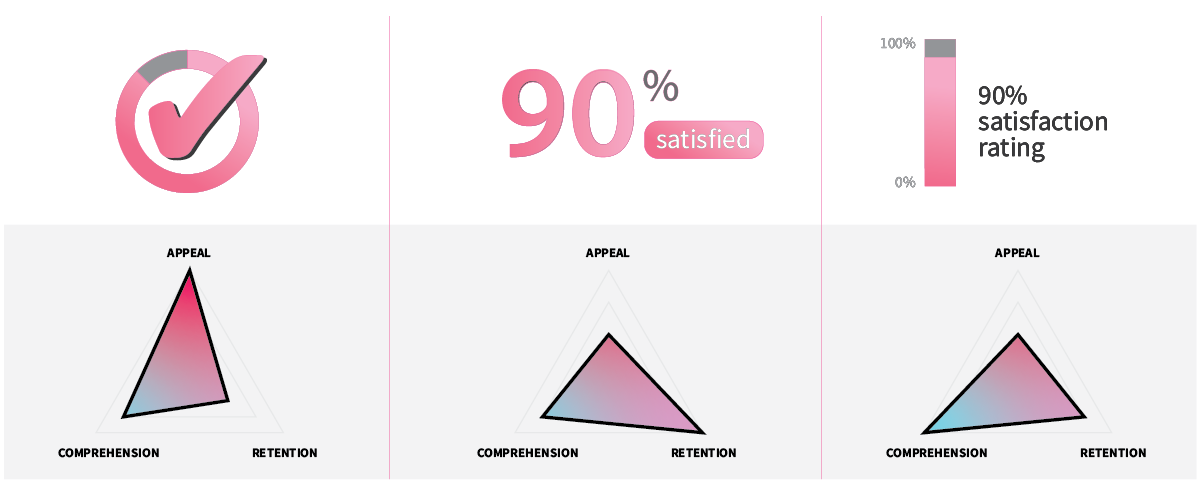
For instance, if you were designing a dashboard with an element to tell a teacher that students were 90% satisfied with their course, you might either (a) make a simple but bold checkmark graphic that subtly shows the percentage in a circular graph without any words, (b) emphasize the actual numeric percentage with a smaller reminder of its meaning with the word "satisfied," or (c) spatially represent the percentage via a bar chart with the descriptive text "90% satisfaction rating" (see Figure 1). In each case, representing elements in different ways (e.g., simple shapes vs. numbers, charts vs. words) will emphasize particular aspects of ARC over others, with the checkmark perhaps being the most appealing but least comprehensible or the large 90% being the easiest to remember but the least appealing.
Figure 2
Example of Emphasizing Different Aspects of ARC to Adjust a Visual Design

Concrete design questions such as "which colors should I use," "should I use labels," or "how large should I make each element" will be shaped by your design goals, with some products requiring greater emphasis on simplicity or beauty and others requiring greater emphasis on complexity or clarity. We will reference the visual designer's ARC in subsequent chapters (especially the project chapters) because different types of designs will have different goals, and how you design will depend upon those goals, meaning that the same principles and guidelines you use to create a course splash page might not apply to a website, mobile app, infographic, icon, or book cover.
Recognizing these goals also helps the visual designer to realize that though beauty is important, it is not the only consideration guiding what is done, and sometimes decisions about how to make a design beautiful should be tempered with other visual aspects of the design that will also have direct impacts on the learner's experience and ability to learn.
Learning Activity
After reading "Aesthetic Principles for Instructional Design" (Parrish, 2009) and "Visual Aesthetics" (West et al., 2018), choose a website, mobile app, video game, e-book, or online course to analyze (e.g., Facebook, Twitter, Apple.com, DuoLingo, a Canvas course). Then, in a reflective journal or class discussion forum, address the following questions:
- How does the product's design reveal differential attention to the three elements of ARC?
- How does the design exhibit attention to Parrish's 4 principles of artful instruction (or not)?
- How does the design exhibit attention to West's six foundational aspects of visual design (or not)?
- Does beauty play an appropriate role in the product's design? How could the product be improved in this regard?
References
Hume, D. (1757). "Of the Standard of Taste," Essays Moral and Political. London: George Routledge and Sons.
Kant, I. (1790). Critique of Judgement, J.H. Bernard, trans. New York: Macmillan.
National Human Genome Research Institute. (2018). Genetics vs. Genomics Fact Sheet. Retrieved from https://www.genome.gov/about-genomics/fact-sheets/Genetics-vs-Genomics
Parrish, P. E. (2009). Aesthetic principles for instructional design. Educational Technology Research and Development, 57(4), 511-528.
Sartwell, C. (2016). Beauty. In Edward N. Zalta (ed.), Stanford Encyclopedia of Philosophy. Retrieved from https://plato.stanford.edu/entries/beauty/
Shelley, J. (2017). The concept of the aesthetic. In Edward N. Zalta (ed.), Stanford Encyclopedia of Philosophy. Retrieved from https://plato.stanford.edu/entries/aesthetic-concept/
West, D., Allman, B., Hunsaker, E., & Kimmons, R. (2018). Visual Aesthetics. In R. Kimmons (Ed.), The Students' Guide to Learning Design and Research. EdTech Books. Retrieved from https://edtechbooks.org/studentguide/visual_aesthetics