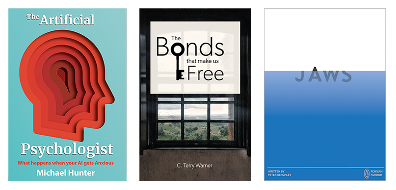
Book covers may not be the first thing we think of when we hear "learning design," but a book cover—or a similar kind of graphic for a course splash page, poster, or advertisement—can be very valuable for framing overarching learning goals and setting a tone for the learning experience. The truth of the matter is that books and other learning materials are often judged by their covers, which means that if you have not thought through how learners will first be introduced to your product, they may never use it or may simply think it's not very professional.
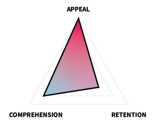
 Book covers are used to convey information about and to inspire interest in a book’s contents. In terms of ARC, book covers are primarily concerned with the appeal, followed by comprehension and then retention. This means that you should make choices in your design that favor beauty, interest, and clarity over deep understanding or connection to learners' schemas or long-term memory.
In this project, you will create a book cover either for yourself or for a fictitious client (anyone from Malcolm Gladwell to Toni Morrison).
Task
Create an original book cover for any book using Adobe Illustrator or another program.
Requirements
- Your cover must include text (title, author) and graphics (drawings, images, etc.).
- You will only need to create the front cover. Do not include a spine or back cover.
Guidelines
- Choose appropriate dimensions. Books have different dimensions depending on their audience and intended reading scenario. Choose one appropriate for you, but if you're not sure, just go with 6" x 9".
- Stick with a single idea. It's easy for the cover to be overcrowded or distracting.
- Ensure that your text is clear and readable. Make it big enough, and use color effectively to draw your reader's attention.
- Consider eye flow. Ensure that the reader's eye will flow in an appropriate direction for your target language (top-to-bottom and left-to-right for English).
- Match tone. Match your colors, fonts, and graphics to your intended tone for your book's content.
Tutorial Videos
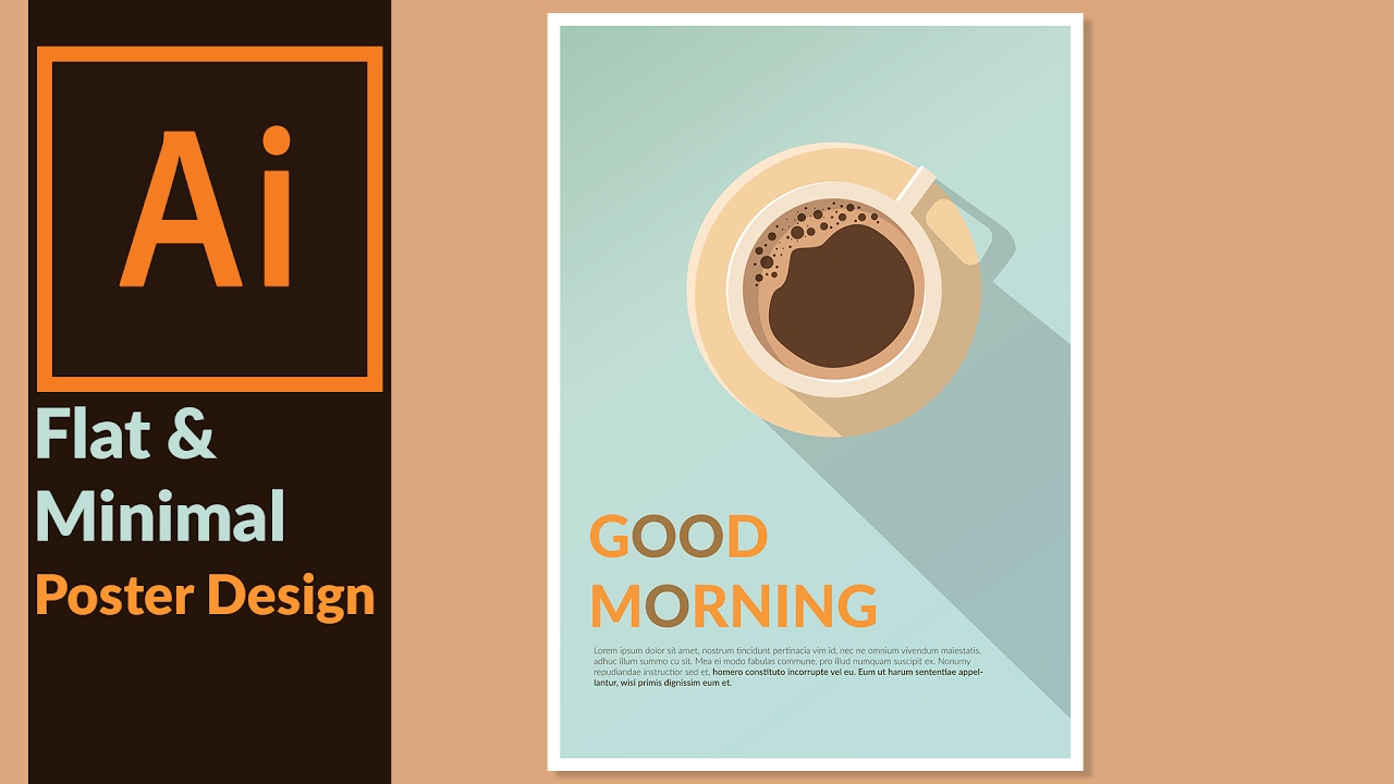
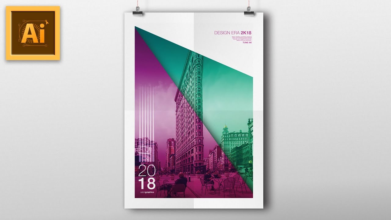
Technical skill-wise, book covers are very similar to event or movie posters. The tutorials here may apply to other types of works, but the tools used are readily applicable to making a book cover.
Designing a Minimal & Flat Design Poster in Adobe illustrator


 Watch on YouTube
Illustrator Vector Poster Design Tutorial


 Watch on YouTube
Evaluation Criteria
| |
Unsatisfactory |
Basic |
Competent |
Professional |
| Appeal |
| Color |
Color is not used or is distracting, disharmonious, or confusing. |
Color is used in a non-distracting manner … |
… that enhances visibility … |
… and enhances meaning and aesthetics. |
| Layout |
The layout is either cluttered or overly sparse. |
The layout gives sufficient space to all elements, … |
… organizing them in an aesthetic manner … |
… that fosters readability and instant recognition. |
| Graphics |
Few original graphics are used, or graphics are poorly constructed, not discernible, or distracting. |
Original graphics are used (e.g., illustrations, graphs, icons) … |
… that are clearly discernible for what they are … |
… and improve aesthetics in a professional-looking manner. |
| Font |
Fonts are not used or are inappropriate, inconsistent, or frequently changing. |
Appropriate fonts and text sizes are used … |
… in a consistent manner … |
… that only changes to enhance meaning (e.g. preattentive attributes). |
| Retention |
| Visualization |
Visuals do not effectively support the memorability of the book. |
Visuals effectively support memorability of the book … |
… by grabbing viewer attention … |
… in an unforgettable manner. |
| Comprehension |
| Type |
The type of book does not align well with the cover design. |
The cover design matches the book contents in tone … |
… and conveys necessary information about contents … |
… and inspires interest. |