"If I have seen further it is by standing on the shoulders of Giants."
Sir Isaac Newton
Many large companies have the difficult task of organizing UI, UX, graphic, and instructional designers around common projects, spanning lengthy timeframes, different departments, and varying project goals. This is further complicated in the cases of companies that provide products that external designers work on as well, such as the case of software and mobile applications created for Microsoft, Apple, or Google-based devices. For instance, Apple's success as a company has largely been determined by their ability to make highly-usable devices and software, but as they open up the design process to third parties via their app store, they must also maintain some standard tonal and quality assurance measures so that whenever someone uses an iPhone app they are getting a quality "Apple-like" experience, no matter who the developer of the app happens to be.
To maintain some semblance of uniformity and commonality, these companies often create design guides, which provide specific instructions on the "Dos" and "Don'ts" of design in their environments. These design guides are very helpful for designers in a variety of settings and are not wholly unique to the company. That is, a design guide created by Google might be similar in many ways to a design guide created by Apple, and designers can either choose to explicitly follow one of these guides or look deeper and seek to understand the common elements of these design guides that constitute quality design across platforms and environments.
Design guides are also useful for designers because they are very explicit in practical elements of design, such as how much padding to put in a button element, when and how to use shadows, when and how to use colors, and so forth. This can make life easier for designers who find themselves having to make hundreds of decisions that they may not have explicitly thought through previously, such as how large to make fonts and why. They can also provide explanatory support for designers when they must explain their decisions to clients.
Below I will provide links to some of the best free design guides available so that you can explore them to determine how you can use them in your designs and also search for common principles and practices across each.
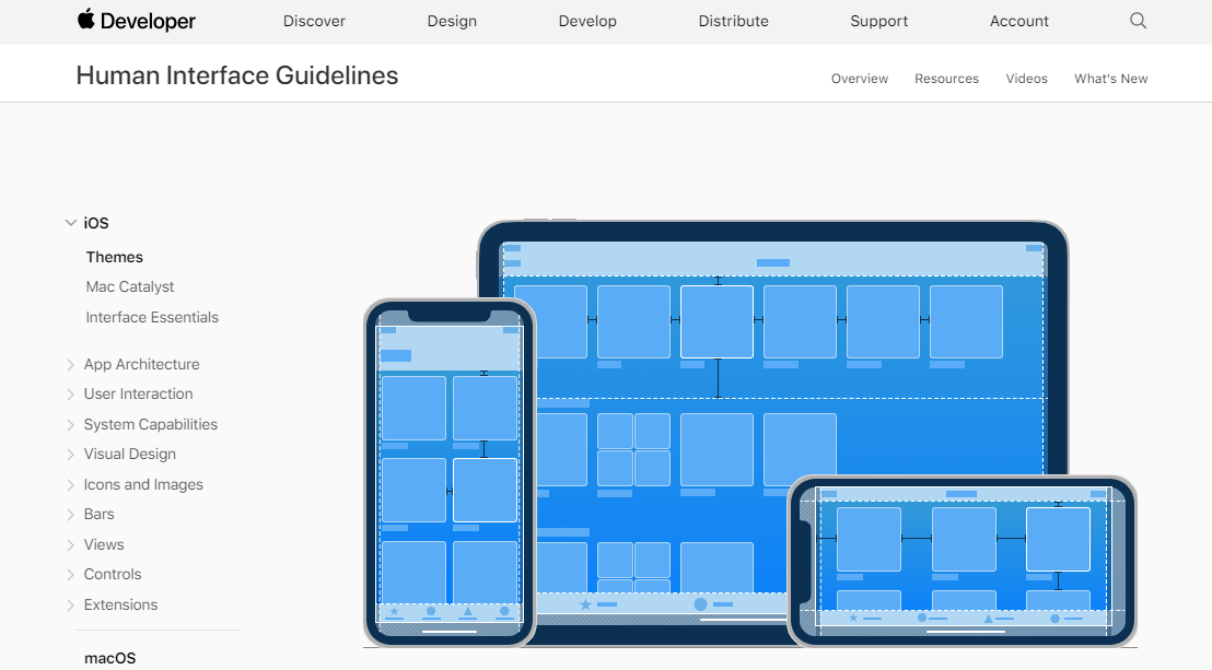
Apple Human Interface Design
Apple's Human Interface Design is provided primarily to software and app developers to help ensure that their products match the tone, style, and quality of Apple's own products.

Explore Apple Human Interface Design
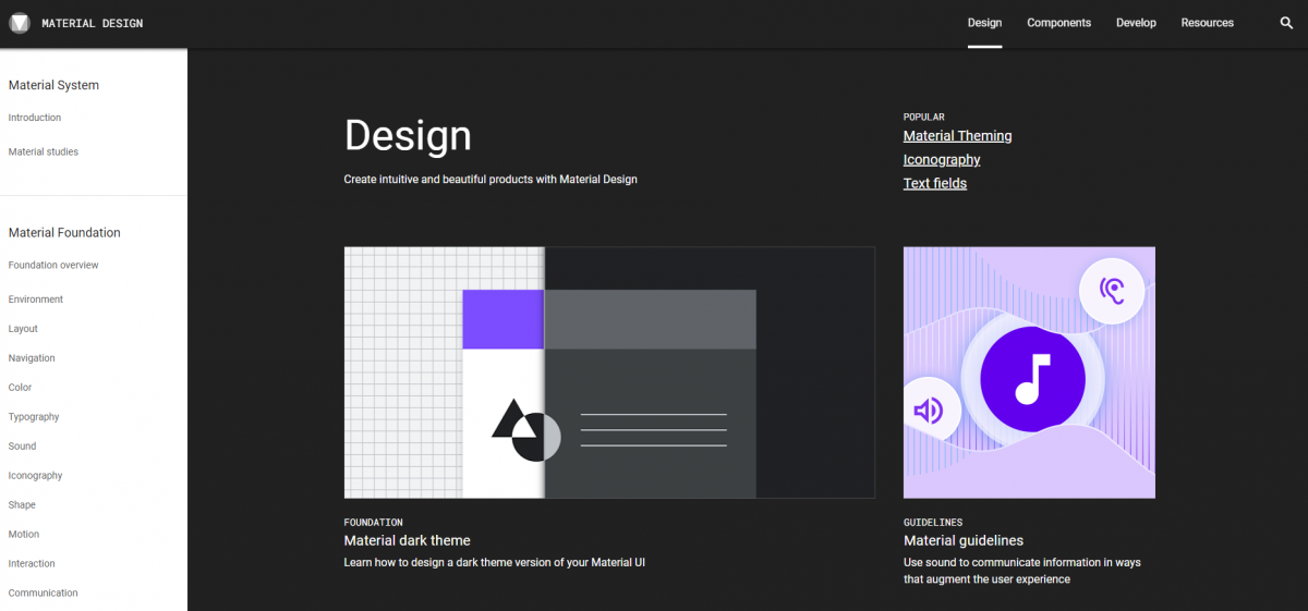
Google Material Design
Material Design was created by Google to guide designers in the development of products across various "materials." This includes websites, apps, print materials, etc.

Explore Google Material Design
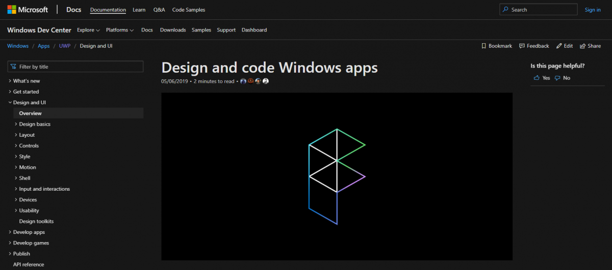
Microsoft Design
Microsoft Design and standards for Windows apps are meant to ensure that apps built for Windows-based computers and phones are uniform and of high quality.

Explore Microsoft Design and Coding for Windows Apps
Learning Activity
Spend at least 20 minutes exploring each of the three design guides mentioned above. Then, in a reflective journal or class discussion forum, address the following questions:
- Which design guide resonated most with you in terms of visual style and why?
- Which design guide did you find to be most useful and why?
- What commonalities and differences did you notice between the different approaches to design?
Open this shared Google Spreadsheet and contribute one row of information, where you (a) ask a visual design-related question, (b) answer the question from each of the design guides' perspectives, and (c) summarize a common principle derived from them.