Hypothes.is Social Annotation
This chapter is annotated every year as part of an undergraduate/graduate class on Teaching and Learning with Technology. To turn off the highlighted text, click on the "eye" icon in the top right corner of the browser screen.
Introduction
Consider this: You recently attended a national conference and discovered a fascinating digital tool from a session. You thought it would be a perfect match for your class, so you integrated this tool into a lesson for your first day back from the conference.
However, it did not go as planned...The students had no idea how to use the tool. The tool had too many features that overwhelmed students rather than supporting their learning. Some of the students could not open the tool on their device or browser. Many students complained about how long it took to load the tool due to the slow school wifi. The students were frustrated and stressed and too much class time was wasted on figuring out the tool rather than using the tool for learning.

We have all been there—wrapping up a class feeling frustrated, just like the students, because the technology did not work out as planned. In this case, the problem was the tool did not provide students with a good user experience.
In this chapter, we will discuss how to evaluate the user experience of digital tools and apps so you can prevent this type of experience in the future. We will focus on five key features to help you identify the best tools for maximizing learning and minimizing technology frustration.
Before you get started with exploring the chapter, watch the Evaluating the User Experience Powtoon animated video featured below for a brief overview of the chapter content.

 Watch on YouTube
What is User Experience?
Generally speaking, user experience is the interaction between the user and the tool, including the user’s thoughts, feelings, and perceptions of the product or outcomes (Tullis & Albert, 2008)
When students feel a tool is easy to learn to use and navigate, they are more likely to engage with it, enjoy the learning experience, and focus their learning on developing knowledge and skills.
[NOTE: Professional user interface designers, such as Donald Norman, can provide more detailed insight into the best practices that software designers take into account when designing new tools.]
Top 5 Features for Evaluating User Experience
Through conversations with educators and researchers, we identified five key features that will help you quickly evaluate a new digital tool or app and make a decision about whether to use it in your classroom:
User Instruction
User instruction is the guide provided to new users that accompanies a tool. It contributes to the user’s first impression of a digital tool when it teaches the user how to find, use, and manage its functions.
When a tool provides good instruction, students are more willing to use the tool and more confident when they use it. This means students will spend their time on learning content knowledge and skills rather than learning the tool itself.
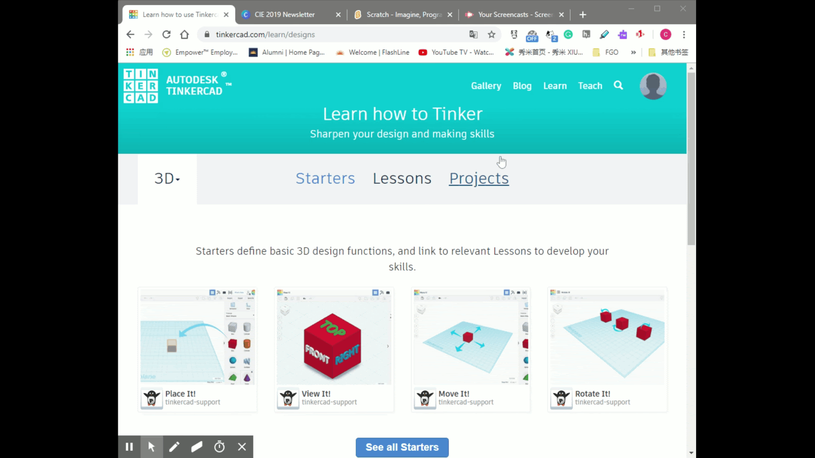
Tinkercad, a digital 3D modeling tool, offers a well-designed user instruction feature that makes it easy to learn how to create 3D models.
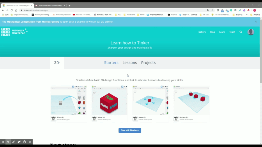
On Tinkercad, instructions are divided into three categories: (1) starters, which cover basic operations like moving an object; (2) lessons, which teach specific functions, like combining multiple objects or hollowing shapes; and (3) projects, which contain advanced model building skills.
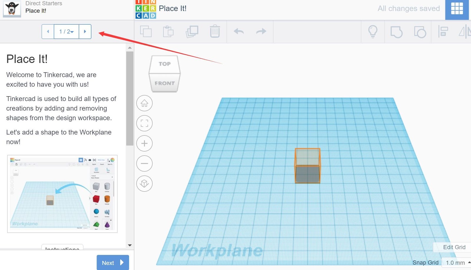
In each of these three types of instructional tutorials, users can follow step-by-step instructions while trying out the directions directly in the Workplane on the right side. Here are the two advantages of this instruction:
- Step-by-step tutoring: Step-by-step tutoring is easy to follow and students can practice the operations simultaneously, which allows for a hands-on, trial-and-error learning experience in a safe space (e.g., students can make mistakes and learn from their mistakes in a virtual sandbox rather than on their own projects).
- Multimodal instruction: The instructions feature text, images, and videos, which are multimodal ways to learn how to use the tool. Using multiple media removes barriers to learning, increases student engagement, and stimulates students’ motivation (Bass, 2020).
Perhaps students will try the tool without exploring the user instruction tutorials. If a student gets stuck and can’t figure out how to use a certain feature, you can walk them through (or point them to) the user instruction tutorials to demonstrate the operation of the tool. This can reduce the need for you to provide substantial technical support and troubleshooting.
The next time you come across a new digital tool or app for your classroom, ask yourself the following questions:
- How will students learn to use the tool?
- Does the tool provide multimodal instructions (e.g., images, text, and video)?
- Does the tool provide interactive instructional tutorials?
- How much class time would be spent on students learning to use the tool?
- Do you need to provide additional instruction to students?
User Interface
The user interface (or “UI”) is “the means in which a person controls a software application or hardware device. A good user interface provides a ‘user-friendly’ experience, allowing the user to interact with the software or hardware in a natural and intuitive way” (Christensson, 2009, para. 1).
Well-designed digital tools are easy to navigate, have a clear and simple layout, and have readily accessible controls and features. Here are some principles to evaluate the user interface of a new tool:
1: Less is More
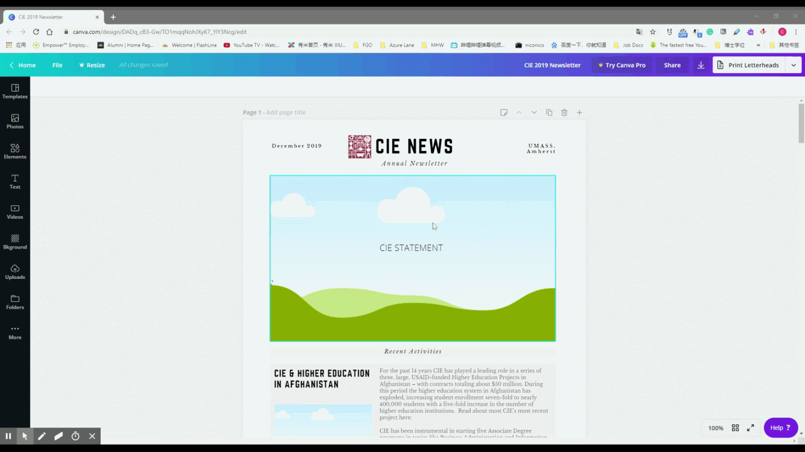
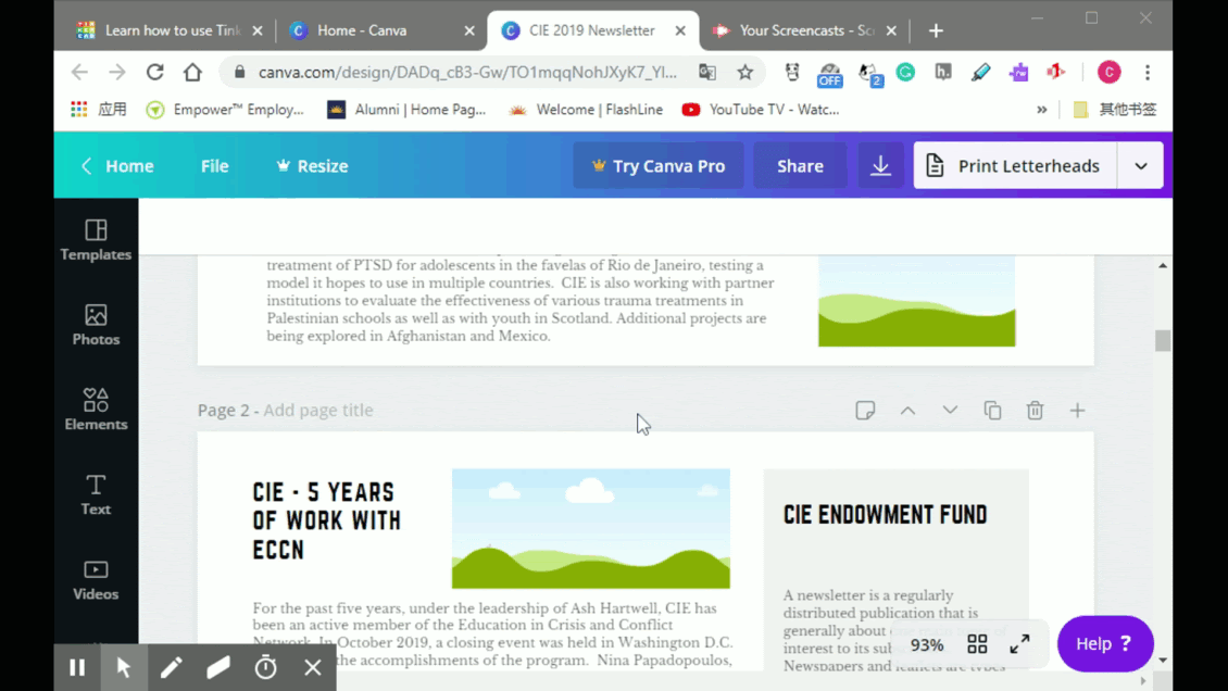
A good user interface will only include controls directly connected to the user's current needs. For example, Canva, a graphic design tool, features only the design functions toolbar (which can be hidden) and the project workspace. This simple, but effective, user interface makes it easy for the user to focus their attention on the design project.
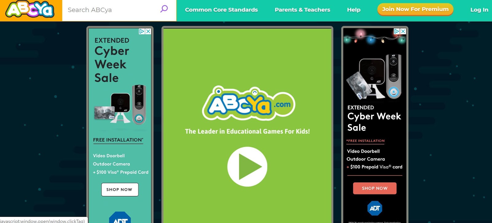
A poorly designed user interface, with too many features or an unintelligible layout, may confuse and exhaust users as they are working on their tasks. In addition, user interfaces with too many advertisements may distract the user from tasks, and sometimes the ads can be inappropriate for young users, like in the screenshot below.
2: What you see is what you get (WYSIWYG)
The interface should allow users to see and edit a project in a view that shows them what the final product will be. In that case, the students do not need to memorize the complicated codes and can focus on their work.
For example, while the final outcome of using a WYSIWYG web design tool like Wix is the same as using complicated HTML coding, Wix is much more intuitive and easier to learn. Therefore, students using Wix will spend more time learning about the content they are posting on their websites and less time learning the coding skills needed to create a website.
 Unless you are teaching coding, look for tools that do not require coding capabilities to use the features of the tool or produce artifacts
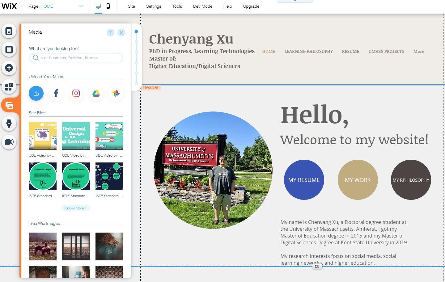 Wix, for example, allows students to design without HTML knowledge and see their design unfold as they build it (WYSIWYG)
3: Sharing Work With Others is Easy
When using digital tools and apps for learning, students will need a way to share their work with you so you can assess their learning and provide feedback. If a tool allows users to export files in multiple, generally compatible formats (e.g., .pdf, .jpg, .doc), students will have the flexibility to post and present their work on different platforms, such as a class website, ebook, interactive document, or social media platform.
When students get to share their work with an authentic audience (e.g., family and community members, authors, scientists), they will be more engaged and invested in their learning experience. So, when you evaluate the user interface of a digital tool or app, check to see how student work can be shared. Bonus tip: If the tool does not allow students to share their work, teach students how to capture screenshots to show their learning with the tool.
4: Collaboration
For many years, the Google Apps for Education Suite (e.g., Google Docs, Slides, Sheets) has offered an innovative learning experience where users can collaborate and work together in real time even if they are not in the same location. Some tools are starting to follow suit, such as Padlet, while others allow for multiple users to work on the same project asynchronously (e.g., Powtoon allows users to “collaborate” but only one person can be using the tool at a time).
Since social learning experiences enrich and advance knowledge and skill development (see the Evaluating the Learning Experience Chapter) it can be beneficial to examine whether a tool supports collaboration, either simultaneously or one user at a time.
Some additional user interface considerations include:
- Does the interface align with Mayer's Multimedia Design principles (e.g., signaling, coherence, spatial contiguity)? Take this interactive self-assessment quiz (designed by Elise Fredericks, Emma Ferrari, Madiha Noor, Sam Torres, and Sara Shea) to learn how to evaluate tools based on the design principles.
- Does the interface clearly represent (“afford”) what the features do?
- Is the interface clearly labelled and does it provide a mix of text and symbols (e.g., recognizable icons, such as a home page, download, or social media symbol, aid memory and navigation)?
- Is the interface consistent across its own screens (i.e., are buttons and menus in the same location?) and does it use symbols and terms consistent with other similar software?
- Does the interface behave predictably? Do you know what will happen when you click a control? Can you undo if you make a mistake?
Access Across Devices and Platforms
When a tool will be used in a computer lab or on the same devices from a cart, cross-platform usability may not be an issue. However, if the tool is being used in environments where multiple kinds of devices are being used, or if students will use this tool on personal devices, it is important it operates well across different platforms. Therefore, when evaluating the user experience, it is helpful to determine how the tool or app can be accessed.
Try the Tool on Different Devices and Browsers
Test the tool on the operating system(s) (e.g., Windows, iOS, Android) your students will use either at home or in class to access it. For web-based digital tools, test whether the tool works on different browsers (e.g., Firefox, Safari, Chrome, Edge).

Evaluate Mobile Access
Students often use mobile devices to complete school work. If you will be assigning a digital tool to be used at home or if you allow students to use their phones during class time, make sure the tool is compatible with mobile devices.
Search for the tool in app stores to see whether there is a mobile app version. For web-based tools without a mobile app, test the compatibility for mobile devices on a computer by shrinking the screen to see whether the page layout changes (this is called mobile responsiveness) (see GIF below). Also check buttons and icons on the mobile version and make sure students can find the features easily.
Confirm Students Have Access
Before assigning tools and apps for homework that require access to a personal computer, tablet, mobile phone, and/or the Internet make sure every student in the class has ready access to the necessary device and Internet (here's an example Google Form check in survey).
In some households, everyone shares a single device or students may only have access to devices provided by the school or available in public libraries. Some students may not have high-speed Internet access (or any access at all) to be able to stream class lecture videos or download interactive simulations. Check whether students have Wi-Fi at home and search mobile hotspots available as an alternative.
Diversity and Language Support
Before using a tool in the classroom, you should examine whether it supports diverse learners. Make sure students can choose diverse icons, flags, gender marks, and characters without additional payment (paid membership or fees).
Eric Velasquez, award winning author and illustrator of children’s books, commented that “once children see themselves represented in books, their existence is validated, and they feel that they are part of the world” (as cited in McDonald, 2020, para. 1). The same is true for edtech tools. When students are able to select and use characters and icons that represent their culture, race, and other identifying features, they will feel empowered rather than invisible. A good example would be Powtoon, which contains characters from different races in the free object sets.
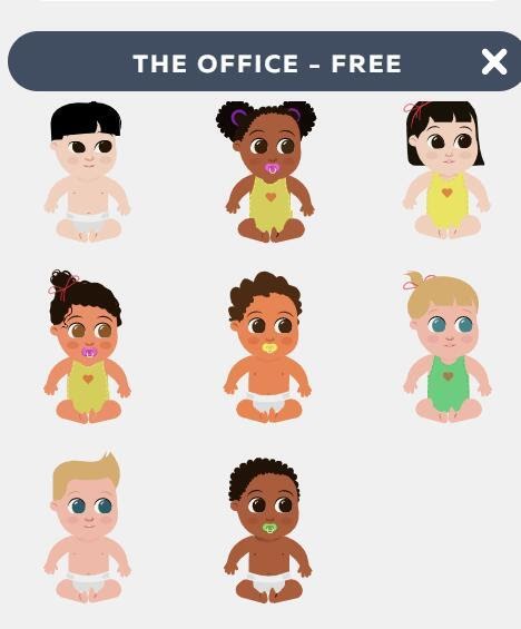 Powtoon free character set, which contains diverse skin color
In addition, English language learners (ELL) and multilingual students can benefit from tools that feature translation support (Knutson, 2018). Using a tool that supports multiple languages can reduce the language barriers multilingual students might face and improve engagement and learning.
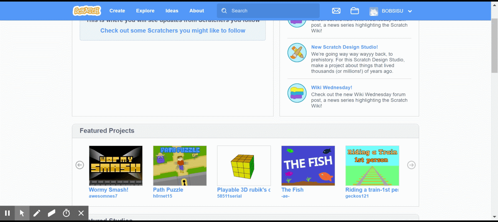
Language selection can usually be found in profile/account settings, sidebars, or at the bottom of the tool webpage. For instance, at the bottom of the Scratch main page, there is a drop down box that says “English,” which allows you to select from more than 60 languages. Once you select a language, the entire site will be translated into that language.
 Tinkercad offers multilingual support at the bottom of its main page
Cost and Required Devices
When evaluating a digital tool, keep in mind the associated costs of using the tool. Consider whether the digital tool will cost any money upfront (e.g., paying for a monthly or yearly subscription) and whether the tool requires you to purchase equipment. If the tool is free to use, identify how the company plans to make money (e.g., upselling features, placing advertisements on the user interface, or collecting and selling user data—see the Evaluating Cost, Privacy, and Data chapter).
Purchasing tools and apps can be expensive, especially when the money comes from your own bank account. In the article, “$15 A Month is $180 a Year: How Much Do You Pay A Year for EdTech?” Alice Keeler, an edtech integration specialist, did a brief survey of the costs of paying for quality edtech tools. She wrote: “I used the checkbox feature in Google Sheets to automatically tally up how much it would cost a teacher to pay out of pocket if they were to buy several EdTech tools. It’s not hard to get to $1000 quickly!” (Keeler, 2018, para. 3).
Two things you should keep in mind when examining the cost of tools and apps are the trap of the trial and required hardware devices.
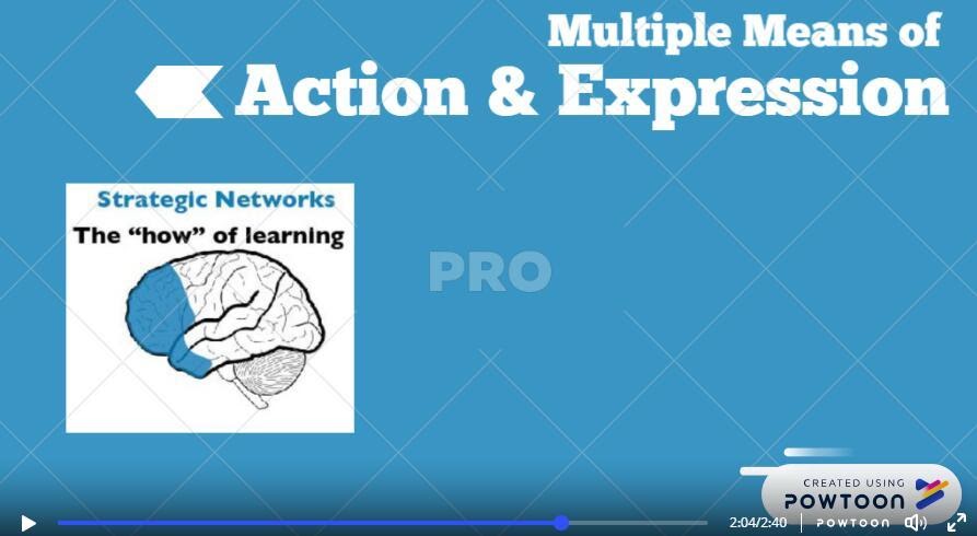
1: “Trap” of trial
Some tools are free to use, but just for a limited period of time. Make sure to check what happens after the trial. Be aware that sometimes features will be lost after a trial. Sometimes the user will lose access to their projects created during the trial, or sometimes their products will be “watermarked.”
Take Powtoon as an example: After the trial ends, your video will have a “PRO” mark if you used pro contents, which were free to use, during the trial.
2: Hardware Devices
Sometimes the tool is free. However, to achieve the best learning outcome, you may need to purchase extra hardware (e.g., a virtual reality headset, Merge Cube for an augmented reality app, or a 3D printer for a 3D modeling tool).
Examining the costs upfront will ensure that you won’t face any surprises when you go to use a tool in your classroom - like discovering that students can’t export their work without paying for premium access.
If you find a tool, app, or hardware that you really want for your classroom but can’t afford, check out the following article: No Begging Required: Teachers Share 5 Creative Ways to Fund Classroom Technology.
Important Points to Keep in Mind When Evaluating Tools and Apps
As you may have noticed from this chapter, there is a lot to keep in mind when evaluating the user experience of tools and apps. We put together this checklist to make it easier for you to quickly evaluate and identify the best tools for your practice:
- Does the tool or app provide user instruction?
- Is the instruction easy to follow, multimodal, and interactive?
- Is the interface clear (simple, no distracting information or elements), easy to navigate, and ad free?
- Can students collaborate and share their work in the tool?
- For Apps: Does the app have Windows, iOS, and/or Android versions?
- For Digital Tools: Is the tool website responsive on mobile phones? Can it be used on multiple browsers?
- Does the tool or app provide free diverse characters/icons? Does it support multiple languages?
- What is the cost of the tool? Does it require any extra hardware?
Five Edtech Tools With a Quality User Experience
Based on the evaluation standards mentioned previously, we will introduce five tools that have excellent overall user experience.
G Suite (suite of tools for productivity and collaboration)
- Instruction: Step-by-step text-based instruction. Separate instruction for Windows, iOS, Android.
- Interface: Concise layout with rich information. Icons with a high degree of identification.
- Access: Windows. IOS. Android. Mobile App.
- Language Support: Multi-language interface.
- Cost and Devices: Free to use all functions. However, Google collects a significant amount of data from its users (see the Evaluating Cost, Privacy, and Data chapter).
Canva (visual designing tool)
- Instruction: Well-divided, text-based instructions. Step-by-step tutoring, which is easy to follow.
- Interface: Clear UI, easy to understand. Elements are easy to manipulate with a mouse. WYSIWYG.
- Access: Windows. IOS. Android. Mobile App.
- Language Support: Multi-language interface.
- Cost and Devices: Extra templates and graphics for premium members ($12.95 per month).
- Diverse Character/Icon Selection: Canva uses Pixabay and Pexels to provide some (but not many) diverse and multicultural images. On the other hand, there are limitations in the diversity of icons offered.
Scratch (Coding tool)
- Instruction: 25 instructive animations, demonstrating most of the features and operations.
- Interface: Codes are integrated into blocks. Separate tabs for coding, avatars, and sound. WYSIWYG.
- Access: Windows. IOS. Android. Mobile App.
- Language Support: Multi-language interface.
- Cost & Devices: Free to use.
- Diverse Character/Icon Selection: Yes. You can select from a diverse range of sprites (characters) or create/upload your own.
Adobe Creative Cloud Express (formerly AdobeSpark) (graphic and video designing tool)
- Instruction: Step-by-step instruction. Formatting and editing help offered too.
- Interface: Clear user interface with distinct tabs for all three different modes. Individual features highlighted in separate tabs.
- Access: Windows. IOS. Android. Mobile App.
- Language Support: Multi-language interface.
- Cost and Devices: Starter plan is free. Advanced individual plan is $99.99 yearly.
- Diverse Character/Icon Selection: If you search for free photos, Adobe will use Pixabay and Unsplash to provide a wide range of image options which offer diverse and multicultural selections. On the other hand, there are limitations in the diversity of icons offered.
TinkerCAD (printable 3D model designing tool)
- Instruction: Instruction for basic operation and specific functions. Interactive and multimodal.
- Interface: Clear interface, elements are organized well in the sidebar. Layout is straightforward and easy to understand.
- Access: Windows. IOS. Android.
- Language Support: Multi-language interface.
- Cost and Devices: Free to use. 3D printer required for physical model.
Conclusion
We hope this chapter helped you identify criteria and features to evaluate in order to select the best tools for your learners. When evaluating digital tools and apps, look for ones that feature:
- Interactive, multimodal user instruction that is easy to follow and understand.
- A simple, easy to navigate user interface.
- Sharing capabilities and multiple output formats.
- Accessibility across devices and platforms.
- Diverse character selection and multilingual interface.
References
Bass, G. (2020). UDL and 21st century learning. Faculty Focus. Retrieved from: https://edtechbooks.org/-xRwz
Christensson, P. (2009, March 31). User Interface Definition. Retrieved from: https://techterms.com
Keeler, A. (2018). $15 a month is $180 a year: How much do you pay a year for edtech? Teacher Tech. Retrieved from https://edtechbooks.org/-hdMX
Knutson, J. (2018). How to use technology to support ELLs in your classroom. Common Sense Education. Retrieved from https://edtechbooks.org/-LRo
McDonald, J. (2020). Diversity in children’s literature: Check your blind spot, Part 2. Center for the Collaborative Classroom. Retrieved from https://edtechbooks.org/-JtK
Tullis, T., & Albert, B. (2008). Measuring the user experience: Collecting, analyzing, and presenting usability metrics. Burlington, MA: Morgan Kaufmann.
Unless you are teaching coding, look for tools that do not require coding capabilities to use the features of the tool or produce artifacts