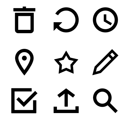
An icon is a simplified graphic or symbol that represents something to your learner, such as an action, idea, or entity. Icons are useful for conveying meaning to your learner quickly with low cognitive load. For instance, using a right arrow to guide your learner to the next page of a book is simpler, less-distracting, and faster than showing a button that says "Go on to next page." As such, icons are simple, stylized representations of something you want your learner to do or to understand, and most visual learning design projects, like apps, websites, or infographics, will use icons extensively.
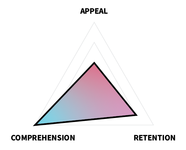
 In terms of ARC, icons must first-and-foremost be readily discernible for what they are, meaning that comprehension is paramount, followed by retention and then appeal. This means that you should make choices in your design that favor simplicity, recognizability, and conformity to intuition and norms over novelty, detail, or complexity.
Any visual learning design project is much simpler if you start with a library of pre-existing components, such as icons, fonts, buttons, and badges, and there are many free libraries of resources online that can help you. Icons are particularly helpful, because they can be used for a variety of purposes, such as buttons, graphics, logos, and bullet points, and because the meanings of many icons have become almost universal (e.g., a right-pointing arrow means "next," an "X" means "cancel" or "delete," and three horizontal lines means "menu"). You can find great examples of many of these common icons in existing free libraries, such as Font Awesome and Feather Icons.
However, no font library will have all of the icons you will need for every project. Also, icon sets have different themes; so, even if you find a "right arrow" icon that someone else made, it may not match the other icons you are using in your project. For these reasons, it's important to learn how to make simple icons.
Task
Create your own, original library of icons using Adobe Illustrator or another program.
Requirements
- Create a library of original icons.
- Use a common theme for your icons (e.g., health care, gaming, social media, camping, automotive, mathematics, science, education).
- Save your icon library as a single .ai file with separate artboards for each icon in Illustrator.
- Export all icons as .png files with a transparent background at the size 128x128px.
- Name each icon artboard and file with a short descriptive text (e.g., “right-arrow.png”, “first-aid.png”, “xbox-controller.png”, “home.png”).
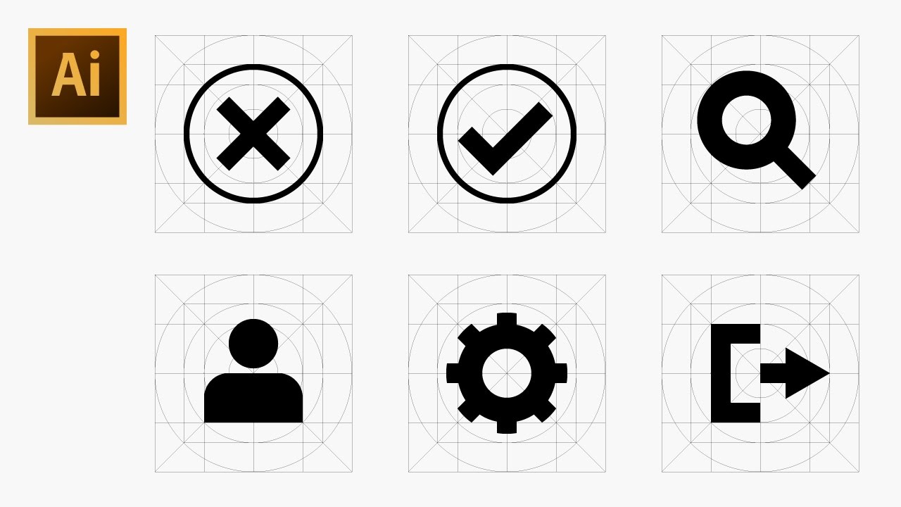
- (Optional) Use this icon grid template if desired.
Guidelines
- Make icons simple. The meaning of a complex icon is difficult to discern, and icons are often used at a small scale, meaning that complexity will be lost anyway.
- Make icons obvious. Choose icons to draw that will have an obvious meaning.
- Make icons uniform. Use a similar style across all of your icons, such as similar fill and stroke options.
- Use common, symmetrical geometric shapes. Don't use an oval when a circle will do.
- Use clean angles. Stick to 30, 45, 60, and 90-degree angles whenever possible.
- Stick with black. Icons can be recolored later in specific situations, but to optimize reusability, keep the original files black.
- Other guidelines from Google Material Design
- Other guidelines from Apple Human Interface Design
- Other guidelines from Microsoft Design
Tutorial Videos
7 Rules for Icon Design


 Watch on YouTube
How to Draw Icons Using a Grid


 Watch on YouTube
Evaluation Criteria
| |
Unsatisfactory |
Basic |
Competent |
Professional |
| Appeal |
| Creativity |
Icons use only pre-existing shapes (e.g., circles, squares, arrows, octagons) or reflect little originality. |
At least 5 icons utilize complex, combined, or original shapes. |
At least 10 icons utilize complex, combined, or original shapes. |
At least 15 icons utilize complex, combined, or original shapes. |
| Theme |
The library does not have a discernible theme or lacks continuity between icons. |
The library has a discernible theme … |
… with stylistic continuity between icons … |
… and appropriate visuals for the theme. |
| Retention |
| Memorability |
Icons do not appeal to intuitive or common constructs. |
Visuals appeal to intuitive or common constructs … |
… by following norms of anticipated meaning … |
… and effectively generating new meaning as appropriate. |
| Comprehension |
| Recognizability |
Icons are not recognizable for what they are intended to represent. |
Icons are discernible for what they are intended to represent … |
… and are unique … |
… and instantly recognizable. |