Perhaps the most common descriptive statistic obtained from a survey is a simple frequency count followed by a proportion (i.e., percentage of the valid responses). Specific frequency results are sometimes reported simply as a textual description (e.g., "40% of respondents indicated satisfaction"); however, results such as these are more commonly presented in tables or charts depicting the number of individuals who select each option on an item.
Frequencies Example (Tables)
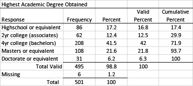
Most statistical packages will provide basic frequency counts and percentages. In this example, respondents were asked to indicate the highest academic degree they had obtained. When there is a lot of data to report, a table is an efficient way to present results.

You will note that six individuals failed to respond to this survey item; this means there was a 1.2% response refusal rate for this item. You will need to clearly indicate whether the proportions being reported represent the valid percentages (i.e., only those who responded to the item) or total percentages (i.e., all who returned the survey, including those who did not answer this question).
It may have occurred to you that in this example, participants were not offered a way to indicate they had not earned any academic degrees. You may also inappropriately assume that the six people who did not respond did so because they had not earned any academic degrees but had no way to indicate their situation. While possible, this assumption cannot be substantiated. It may be that some nonrespondents simply overlooked the question. Obviously, it would be better to have anticipated this possibility and included an option that allowed the respondents to indicate they had not earned any academic degrees.
In this example, cumulative percentages can be useful because the data is somewhat ordinal in nature. Note that it would be inappropriate to average the results. Calculating the mean is only appropriate with interval-level data. It would however be appropriate to point out important trends involving the mode. For example, 41.5% of the respondents had earned a bachelor's degree and 69.3% of the respondent reported earned a bachelor's or graduate degree. Because this is a substantial number, it may be worth pointing out.
Collapsing Categories Example
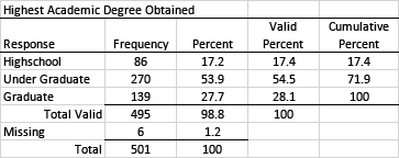
Depending on the research questions, it may be appropriate to collapse categories in order to better understand the data. Suppose you really only wanted to know how many people had earned a college degree of some kind. In this case, you may wish to reorganize the data in the table to present undergraduate and graduate degrees together. It might be important to point out that 81.6% of the respondents had earned a college degree of some kind. You may also need to collapse these categories so you can identify groups for disaggregation purposes.

Likert Scale Example
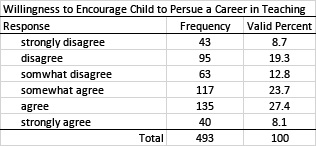
It is quite common for surveys to use a Likert scale to record responses. Because these data are generally considered to be ordinal in nature, it is appropriate to report frequencies rather than averages. Assigning point values for each response and calculating the mean (central tendency) is sometimes done, but doing this would not provide sufficient detail needed to fully understand the response patterns. Note also that, as with the previous example, it is sometimes appropriate to collapse categories when using a Likert scale. For example, "disagree" and "strongly disagree," "somewhat disagree" and "somewhat agree," and "agree" and "strongly agree" might be collapsed from six categories to three.


Crosstab (Pivot Table) Example
Survey research is often table heavy. As a result, we often want to combine tables, especially when we want to disaggregate our data based on some grouping variable. Using a crosstab (sometimes called a contingency table or pivot table) we can combine tables. This allows us to present summaries of our data in a more efficient manner (reducing the number of tables needed). The challenge is to make sure results are well organized and clearly presented.

Inferential Statistics
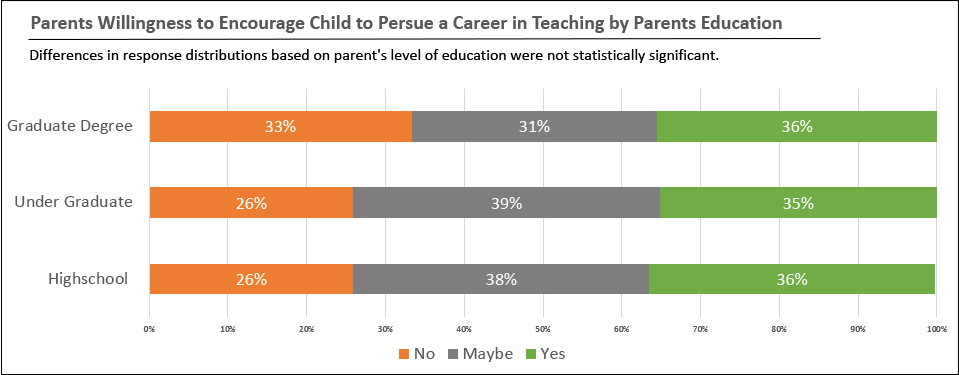
The data presented above is descriptive in nature. It presents a summary of what the respondents reported, disaggregated by the respondents' education level. However, while we see some differences in the response distribution by group, we would need to use inferential statistics to determine whether these results are statistically significant (i.e., whether the difference could be attributed to chance). The appropriate statistical analysis to use will depend on the type of data obtained. Given that these data represent proportions, a chi-squared test of independence would provide evidence of whether any difference in the distribution of responses for each group was statistically significant. Note that if the result was found to be statistically significant, the practical significance should also be calculated and reported.
Data Visualization Example
While tables can be a very effective way to present large amounts of data, often results can be presented more effectively using charts and graphs. Using proper data visualization techniques can enhance the presentation. Choosing the right chart type, as well as paying attention to colors, fonts, and layout, is important.
