Purpose
Yogi Berra once said, “If you don't know where you are going, you'll end up someplace else.” Before you start designing your educational website, it is important to identify the purpose of your site so that you know exactly where you are going to end up in terms of the finished product. To help you identify the purpose of your site, consider two things: 1) Who are you expecting to visit your site? (e.g., Students? Parents? Administrators? Colleagues? Your professional learning network?) and 2) What do you want your audience to be able to do on your website? (e.g., Access class assignments? View student work? Learn about your teaching practice?)
Designing an educational website is much different than other types of website development. You are not trying to get users to buy your product. Instead, your target audience is coming to your website for a reason - what is that reason? You may be setting up a site for your students to keep track of what is going on day-to-day in the classroom or for students to find online resources and activities that extend learning related to class topics. Your website may end up serving several different purposes, but starting with just one can help simplify the initial design process. Whatever the purpose of your website is, keep that purpose in mind at all times and continually check that you are meeting your goal.
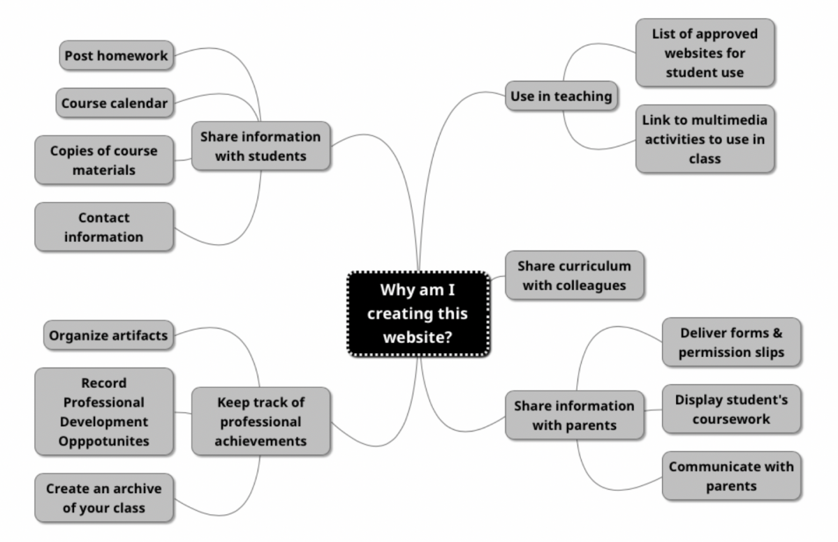 Figure 1: Mindmap of different reasons to create an educational website (created using Mindmup).
Planning
Building a website without some degree of planning can lead to frustration. If you don’t have a plan, you may waste a lot of your time setting up your page with images, content, and menus only to find out that you need to start over because the setup does not satisfy the main purpose of the site. To reduce potential frustration, start your web design process with researching and sketching. For research, explore various websites, including ones that are similar to what you’ll be producing. Look for sites that have a similar purpose as yours and identify sites that you found easy to use or particularly memorable. Jot down highlights from those sites that you could incorporate into your site design. You don't have to include everything at first. Just keep notes about what you liked and you can add features in over time.
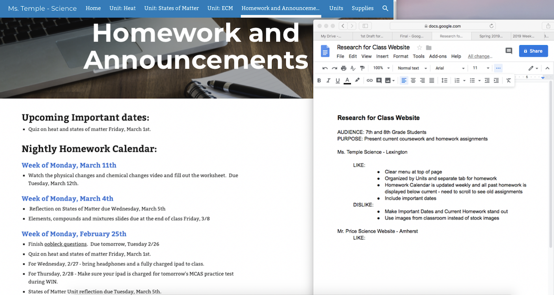
Figure 2: Using GoogleDocs to take notes on Likes & Dislikes of different websites.
Next, sketch out your website organization and visual design. Take a piece of paper and a pencil (several Post-Its work, too) and sketch the layout and content for each page. It is a lot easier in the beginning to rearrange post-it notes or switch around your layout on paper.
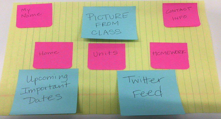 Figure 3: Use paper and pen to experiment with different layout options.
Visual Organization
Layout
The layout of a website defines the location of typical items on a website, including the menu, the banner or logo, the navigation bar, contact information, and social network icons The layout involves decisions about the position of each item on the page, the size of images and text, and placement of visuals. If you were to look at popular websites (e.g., Google, Amazon, and National Geographic) you would find these typical items in similar locations. On many websites, the menu, navigation bar, and logo are found near the top of the page. Contact information and social media icons can be found at the bottom of the page or sometimes in the upper right corner of websites.
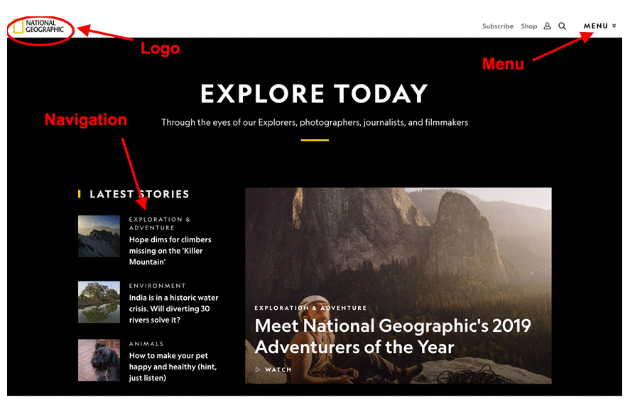 Figure 4: Screenshot of the top of National Geographic’s homepage, noting location of logo, menus and navigation bar.
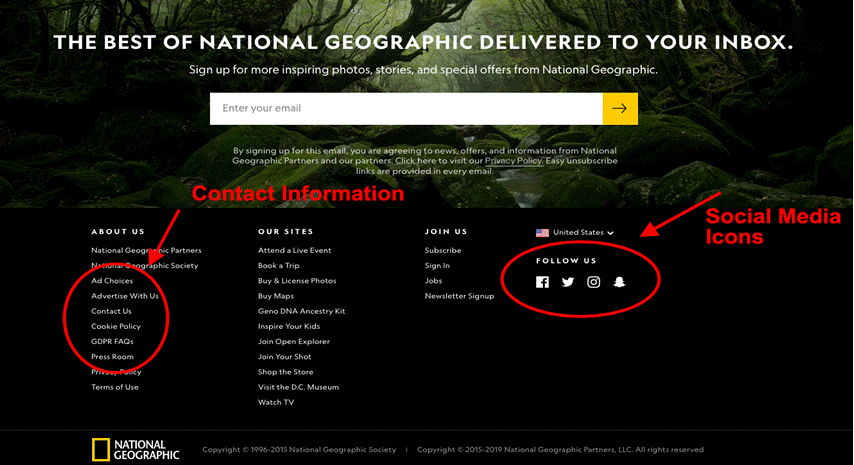 Figure 5: Screenshot of the bottom of National Geographic’s homepage, noting location of contact information and social media icons.
Your visitors are most likely well-versed with website layout without even knowing it. They will look to the same place for the items they need to move around your website. For example, on most websites, when you click the header, you will be taken back to the home page. Keeping with this tradition on your site will ease user navigation. The graph below depicts the typical placement of common website elements:
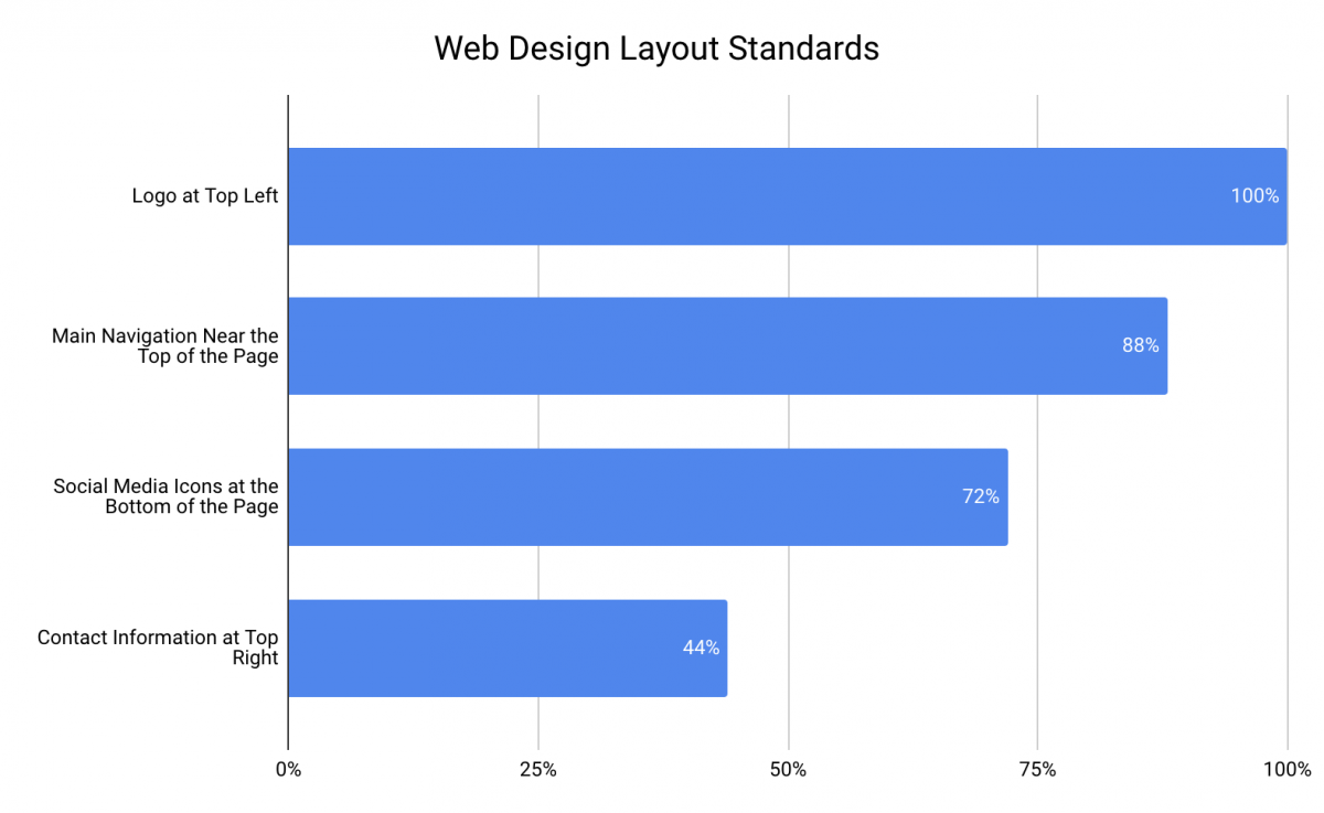 Figure 6: Chart illustrating the percentage of time the placement of key web design features are in a particular location. Figure adapted from Crestodina (n.d.) 27 Research-Backed Web Design Tips: How to Design a Website That Works.
Consistency
Your website should have a layout that is consistent from page to page (e.g., the menu, header, and search engine can be found in the same spot on every page of the website). This can make navigation easier for the user, as they will know where to look or click to move seamlessly throughout the site.
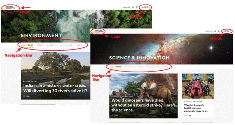 Figure 7: Pages within National Geographic’s website, noting consistency in the placement of web design elements like logo, navigation bar and menus.
Above the Fold
When deciding on the layout of your site, consider what information or visuals will be “above the fold.” This term originated from the design of newspapers - with only the upper half of the front page of a newspaper (the part above the fold) being visible to passersby, editors placed the most important and captivating information there to attract attention and increase readership. This concept applies to web design, but rather than a physical “fold,” you have the bottom of the screen. Anything that requires scrolling is below the fold. Since people spend only a few seconds deciding whether to stay on a website, you need to capture their attention and present the most relevant and interesting information “above the fold” on every page. You could do this by placing a short video at the top of the page, an attention-grabbing heading, or intriguing visuals or text. Keep in mind that the “fold” will be different depending on what device your visitor is using (see Figure 8). You need to be aware of the fold and design your page so that your most important content lies above the fold (to learn more, explore the Above the Fold vs. Below the Fold article).
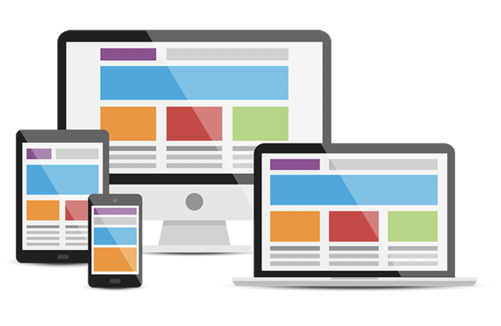 Figure 8: Your home page will look different on different devices - phone, tablet, laptop and desktop. The fold also changes with each device type. Vector Designed By cornecoba from PNGTree.
Navigation
When designing the navigation for your site, keep in mind your website’s purpose and make sure that you are using the simplest and clearest method of navigation to accomplish that goal. You will begin the design of your website with your home page - your main page - the page your users will see first. This page may not be able to accomplish everything. Your visitors may need to navigate somewhere else to find what they need. If a visitor is unable to find what they need in an easy way, they will become frustrated and may not use your website (or curse it everytime they do). When someone wants to find something in a book, they look to the table of contents. On a website, navigation is basically your table of contents. How can you help your visitors find what they are looking for? The main technique used in all navigation schemes is menus. It is important that they are well-organized, easy to use, and easy to find (remember, the table of contents is always in the front of the book!). Also, keep in mind the concept of “serial position effect.” That is, most visitors will look at the first and last items in a list. So make sure the most important items needed to achieve your purpose are at the top of any menu list.
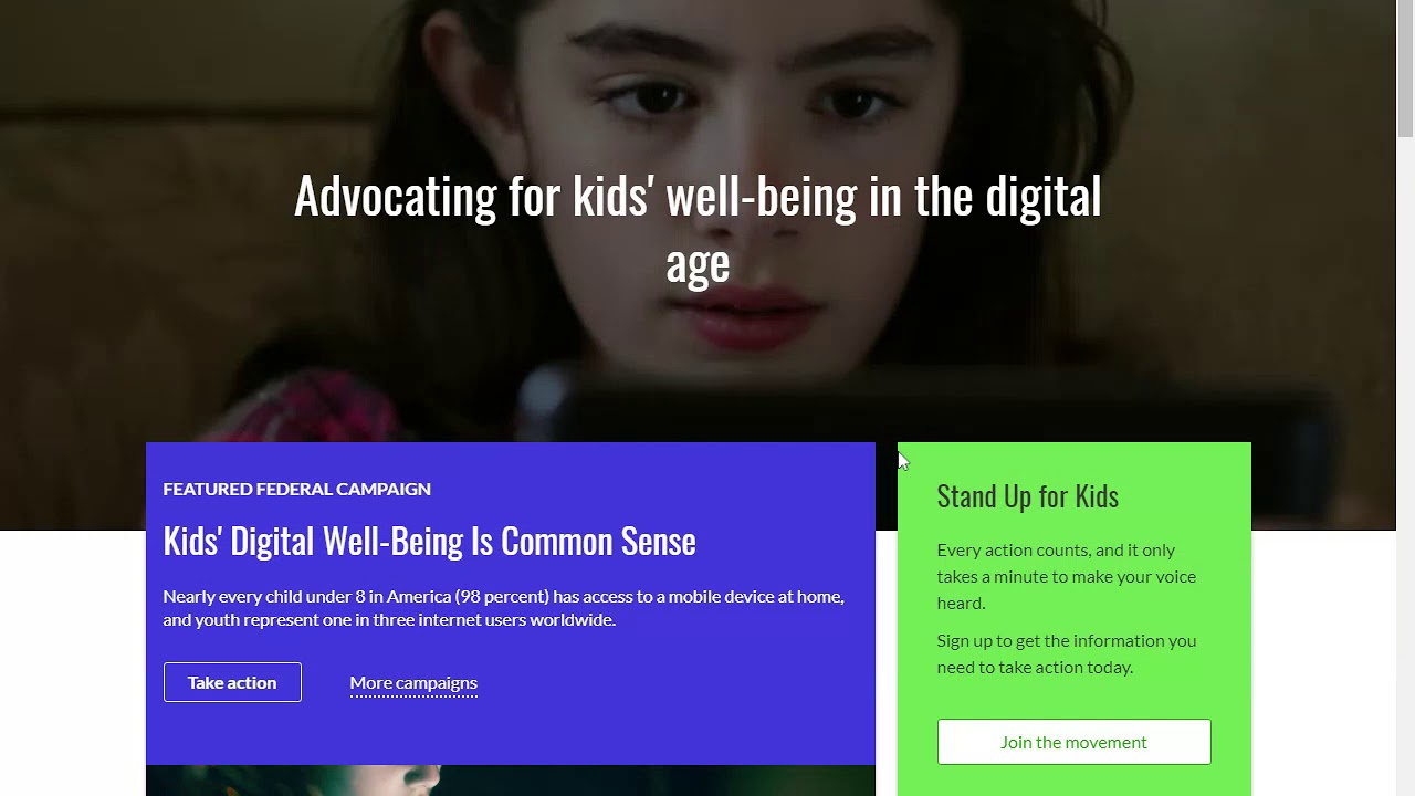
Figure 9: Video from using the Common Sense Media website to demonstrate scrolling, tabs and drop-down menu navigation
Search engines are also a popular navigation tool. Most web design tools, like Wordpress, allow you to embed a search engine within your site. If you opt to do this, make sure the search engine shows up on every page (consistency of layout) and that your pages consist of text (and images with alternative text descriptions) featuring key terms users would search for. For example, if a student visited your site and used the search engine to find “homework,” but your homework page is titled “after-school work” then the search engine would not be a helpful navigation tool.
Another type of navigation is within-page linking. If you have a long page of text or images, it can be beneficial to break up the content by headings and place a table of contents at the top of the page that users can click on to go to specific sections (rather than having to scroll through the entire page). If you setup your website like this, make sure there’s a “back to top” link at the bottom of each section so users can always get back to the table of contents and menu.
One other navigation method worth noting is the use of accordions. This method allows the user to view many heading at once and open as many sections as they want.
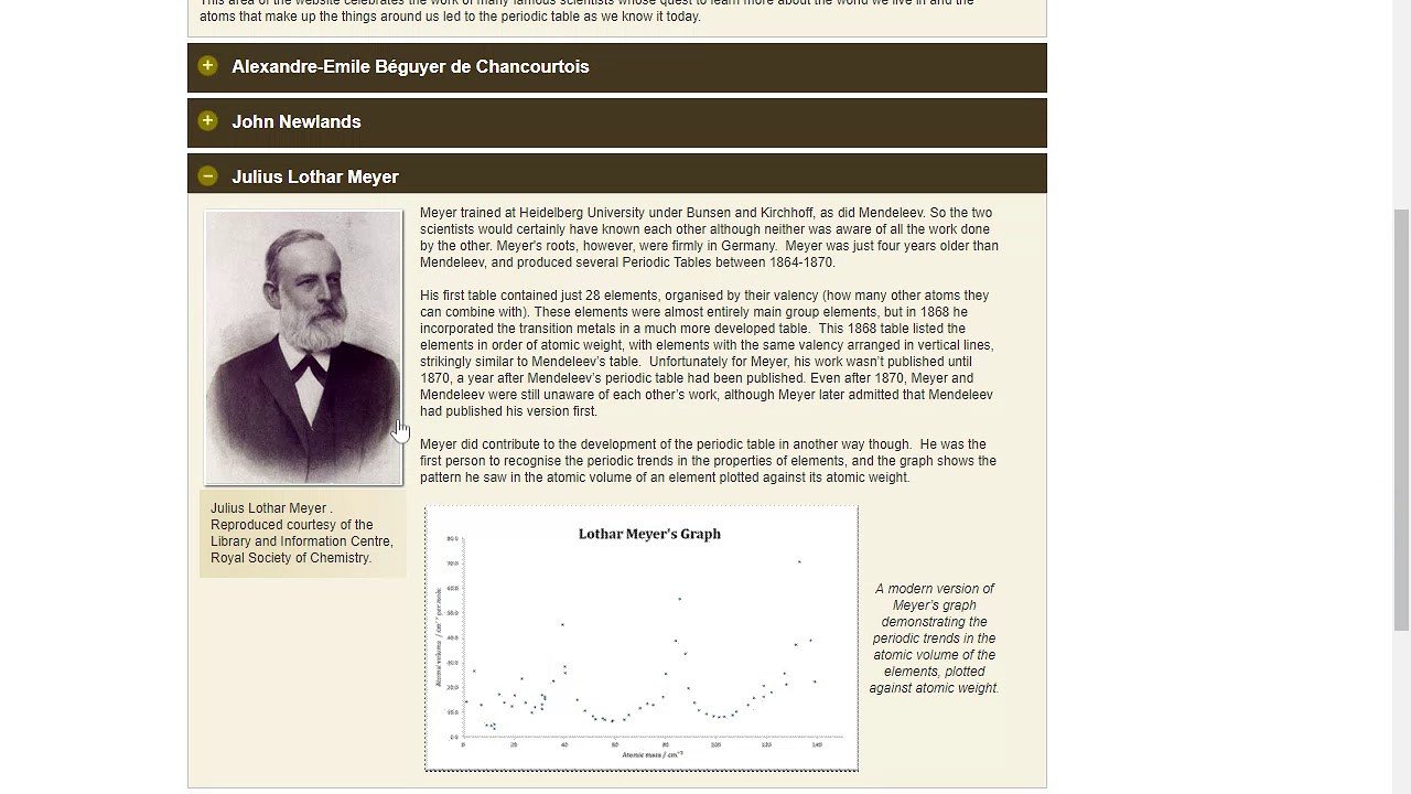 Figure 10: Video using the Royal Society of Chemistry website to demonstrate accordion navigationCaption
Navigation Tip: If you have your users navigate to an external site, make sure to have it open in a new window or tab so that they can always get back to your website.
Visual Design
Visual design covers a lot of territory. Often people hire graphic designers or professional website developers to create visually appealing website designs. Don’t worry! Just like all the other pieces of your website, you can do this too. Remember to keep it simple. You can always go back and add complexity. The main purpose of your website shouldn’t be lost among cool visual effects. Your visual design should not confuse your visitors while they try to navigate your website. In fact, the visual elements should help lead the user to the key items on your website. This is often referred to as visual hierarchy. Web design sites like Google Sites, Wix, Weebly and Wordpress take care of some of the visual design decisions by offering simple templates.
Some basic visual design elements are highlighted on this popular website:
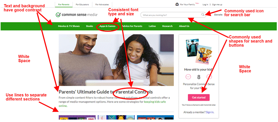 Figure 11: Screenshot of Common Sense Media homepage highlighting different visual design elements.
Guidelines for typical visual design elements:
Text
With text, make sure that it is easy to read. Most browsers default to a 16-point font size to ensure readability and accessibility. You should use that as a guideline and make sure you don’t go any smaller. Use larger text size for titles, headings, and subheadings, so that they stand out from the body of content. Even though it is tempting to use interesting fonts, remember that your website needs to be readable! It is good practice to limit yourself to no more than 3 fonts and maintain consistency in font style from page to page.
Color & Contrast
It may be tempting to use lots of color on your website, however too many colors can be overwhelming and distracting. Use colors to guide your visitor’s eyes to the most important parts of your page. Whatever color palette you choose, whether it is black and white or cool blue tones, use the same colors throughout your website. A helpful color palette generator for websites can be found at Palletton. In terms of accessibility and readability, make sure that color isn’t the only thing used to signal important information (e.g., use bold, bigger font size, or italics) and ensure that the colors you select provide enough contrast so that the text is easy to read. Use the WebAIM Color Contrast Checker to test the contrast of the colors of your fonts and background.
White Space
It is not necessary (or recommended) to fill every square inch on a page. Use white space on your page to reduce visual clutter, make the visual path clear to your user and allow them to find what they are looking for efficiently.
Icons
Use standard icons and shapes on your website. For example, “help” is understood to be represented by a question mark and “home” is often depicted by an image of a house. The Creative Commons website features a list of free (with attribution) icons you can use on your site.
Accessibility
Educational websites are for everyone! Some of your users may have disabilities and your website needs to allow them to access the information you have presented. A recent study of more than 6,000 school and district websites found that the vast majority failed to be fully accessible (Accessibility in Mind? A Nationwide Study of K-12 Web Sites in the United States). Use the Accessibility Statement Generator tool to ensure your website is accessible and to put a statement on your site showcasing that you value accessibility. Also, for more information see Chapter 5: Digital Accessibility.
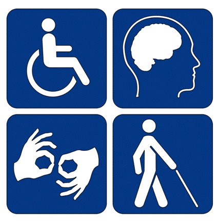 Figure 12: Image of disability symbols - websites must serve and accommodate all people.
Adaptability
Your visitors may be accessing your site using a desktop, laptop, tablet or mobile device. It is crucial that your site work on all of the above. The purpose of your website cannot be lost or inhibited because of different screen sizes. Some of the free website building programs (Wix, Wordpress, Google Sites) incorporate a design or template that is responsive to any device. When thinking about a mobile device, make sure that the text remains legible, your most important information lies above the fold, and that buttons are not too small to be pressed by an average fingertip. Also, make sure to test your website across multiple devices and browsers. The big 5 browsers are: Chrome, Edge, Firefox, Opera and Safari (“How to Design a Website”, 2017). You must test every path, link, and button for correct function.
 Figure 13: Be sure to test that your website responds predictably on all types of devices.
User Interface & Visual Design Checklist
- Declare target audience of website
- Narrow down main purpose of website
- Research other websites
- Sketch out website design
- Build website layout
- Establish clear and easy navigation
- Main purpose remains clear
- Utilize simple visual design
- Make sure to address accessibility
- Test website on different devices
- Test website on 5 different browsers
- Test all links, buttons and navigation path
- Fix any issues
References