Mobile applications are quickly replacing websites as a common way that learning designers now reach their learners. Mobile apps benefit from the same opportunities provided by websites but also allow the learning designer to utilize various smartphone capabilities that are not standard on desktop and laptop computers, such as location services, gyroscopes, cameras, facial recognition, augmented reality, and so forth. This means that learning designers can approach apps similar to how they approach websites, but also that apps may have many potential opportunities that are not available with websites alone.
 In terms of ARC, a mobile application's emphasis will vary greatly by its purpose, but at a basic level, apps may be thought of as being similar to websites in that their primary function is to appeal to the learner and to get them to stay on the app to learn. This means that apps should strive to be clear, sleek, and inviting and should also make it clear to the learner where they are and where they need to go to keep learning
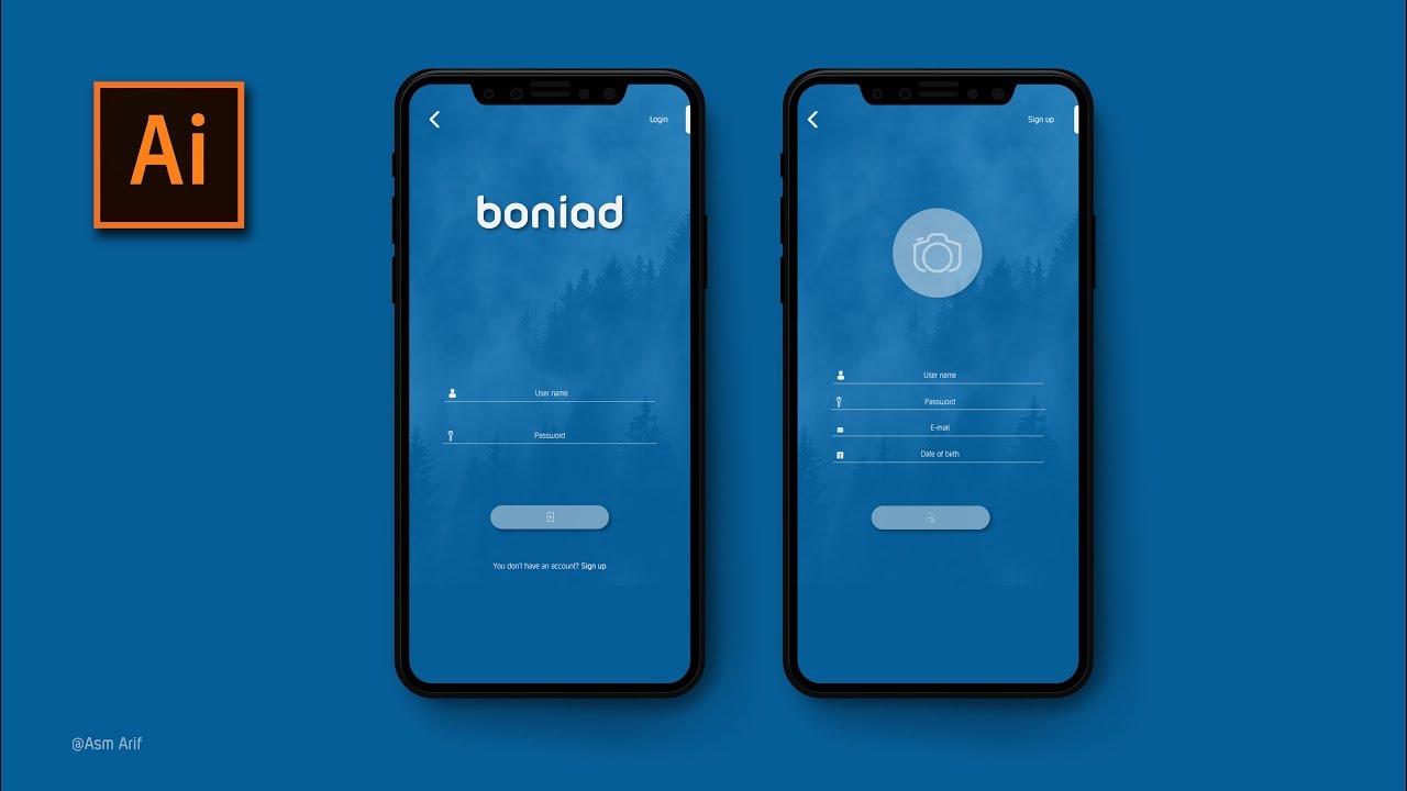
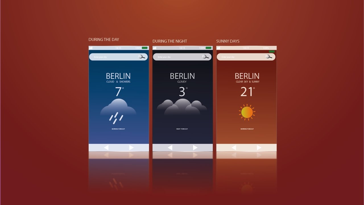
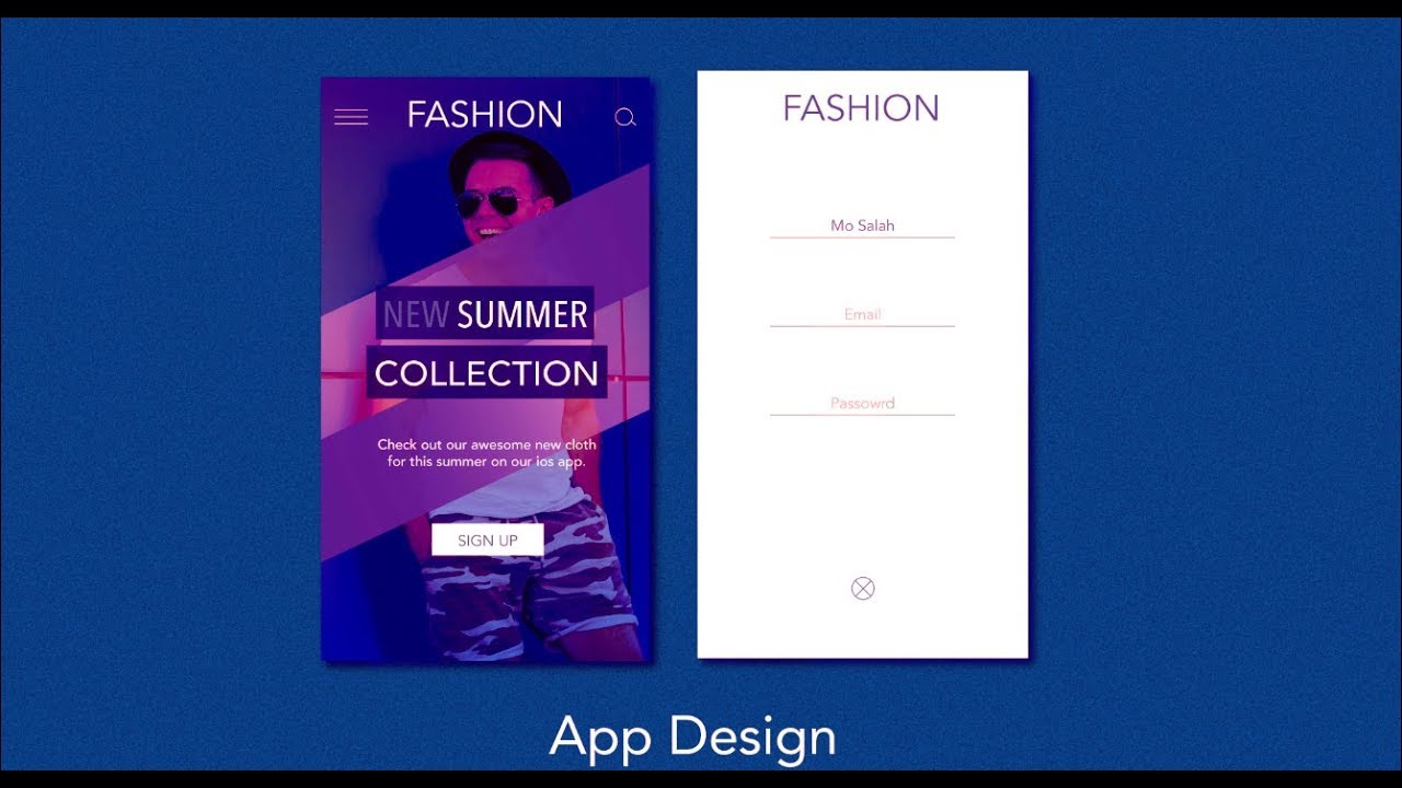
For this project, you will create a visual mockup for an iOS/Android app of your choice for a smartphone or tablet. You are encouraged to use existing User Interface Design Kits (e.g., iOS Design Kit, Google Material Design, Bootstrap, jQuery UI Mobile, Publica) along with Adobe Illustrator to complete this project.
Task
Create a mockup of your own, original mobile application using Adobe Illustrator or another program.
Requirements
- Use a screen size appropriate for your target device (e.g., iPhone X would be 1125 x 2436px).
- Create separate artboards for each page.
- Include mockups of at least 6 pages, including the following:
- 1 homepage;
- 1 form submission page (e.g., login, account creation);
- 1 content page (e.g., item catalog, course list);
- 3 other pages of your choice (e.g., contact, about us, verification).
- When sharing your app, use a program that mimics user interaction and allows your viewer to navigate the app's user pathways, such as InVision or Adobe XD.
Guidelines
- Choose a theme. Color, image, and text choices should be consistent and complementary to your intended theme.
- Represent the user pathway. Choose pages that will allow your viewer to understand the user's pathway through the app.
- Include content. Though you don't need to create all of the textual content for your app, you can populate it with placeholder text, such as Lorem Ipsum or Bacon Ipsum.
- Don't recreate the wheel. Use existing User Interface Design Kits and Design Guides. This will make your life easier and will also make life easier on your developers, should you ever actually build the app.
Tutorial Videos
Apps Design Tutorial


 Watch on YouTube
UI Design in Adobe Illustrator Tutorial


 Watch on YouTube
How to Design an iOS App in Adobe Illustrator UI/UX Tutorial


 Watch on YouTube
Evaluation Criteria
| |
Unsatisfactory |
Basic |
Competent |
Professional |
|---|
| Layout |
The layout is either cluttered or sparse. |
The layout gives sufficient space to all elements, … |
… organizing them in an aesthetic manner … |
… that fosters readability and instant recognition. |
| Color |
Color is not used or is distracting, disharmonious, or confusing. |
Color is used in a non-distracting manner … |
… that enhances visibility … |
… and enhances meaning and aesthetics. |
| Graphics |
Graphics are not used or are poorly constructed, not discernible, or distracting. |
Original graphics are used (e.g., illustrations, graphs, icons) … |
… that are clearly discernible … |
… and improve aesthetics or enhance meaning in a professional-looking manner. |
| Font |
Fonts are not used or are inappropriate, inconsistent, or frequently changing. |
Appropriate fonts and text sizes are used … |
… in a consistent manner … |
… that only changes to enhance meaning. |
| Navigation |
Navigation elements are not used or are poorly constructed. |
Necessary navigation elements are clearly discernible, … |
… logical, intuitive, … |
… and complete. |
| User Pathways |
User pathways are ill-conceived, incomplete, or non-intuitive. |
User pathways clearly exist … |
… that are intuitive … |
… and efficient. |
| Scope |
The mockup contains fewer than six pages of content. |
The mockup includes six or more pages of content but does not include one or more of the required pages listed above. |
- |
The mockup includes six or more pages of content, including the pages described in the requirements above. |
| Presentation |
The mockup is not presented in a manner that allows for user navigation. |
The mockup is uploaded and shared in a manner that allows for user navigation … |
- |
… and all of the links work to allow the user to make their way through the mockup in a fully functional manner. |