Introduction
The use of websites as educational tools provides a unique way for students to access material in a variety of different formats. However, while educational websites may increase access to information, they also present their own challenges. Research suggests that only 16% of people read webpages word-for-word. Most people scan (Nielson, 1997). Additionally, people often spend only a few seconds exploring a site before determining whether to stay or leave. And, with the distracting world of the Internet, where a funny cat video is only a click away, it is even more challenging to maintain readers’ attention on a website.
When you are writing for the web, you must create content that is captivating, engaging, and informative while also being easy to scan. This means writing for the web looks very different than writing for print. Check out our chapter overview video to see an example of how to transform a traditional print paragraph into text that is easy to read on a website.
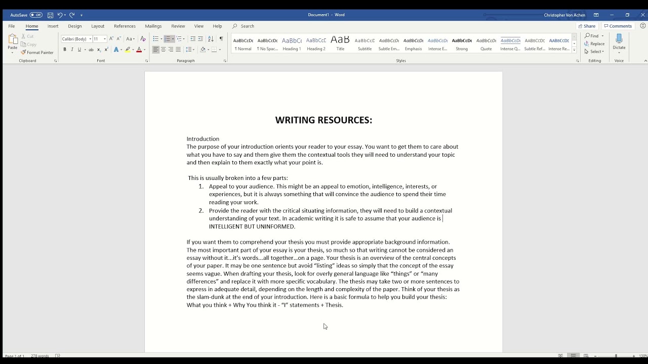

 Watch on YouTube
This chapter will showcase the tricks you need to write web content to capture and maintain the attention of your readers. We will begin by discussing how to use formatting techniques (e.g., whitespace, bold, italics, bullet points, headings, and font size) to facilitate quick reading and to draw the attention of the reader to key information. Then, we will cover how to use language in a way that appeals to your audience. Finally, we will showcase tips for writing subject specific content to engage learners.
Formatting
The way you organize and format a website is the first thing visitors will notice. It’s essential to design your website to be easy on the eyes. Websites that have a lot going on (often referred to as “busy”) are difficult to gather information from and can turn people away from your page. If viewers are overwhelmed and can’t figure out what to focus on, how to find information, or where to go on the site, they will make an immediate exit. The following section offers tips and ideas to improve how your website is read by visitors.
White Space
One way to avoid making your website look busy is by utilizing white space. White space is the unfilled space on your website. Keeping some space free of images or text helps to break up your page to make it less cluttered.
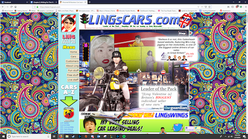
In the example below, the Lings Cars site fails to utilize white space as a means of breaking up the content for two reasons. First off, there is very little background space - most of the website has words, pictures, or menus on it. The remaining background has a complex pattern that is jarring to the eyes. This combination creates a website that is difficult to look at for more than a few seconds, which is not ideal when you want visitors to stay on your webpage.
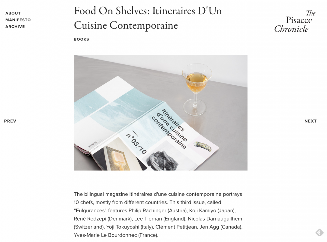
In contrast, the Pisaccochronicle site featured below uses a lot of white space, which makes it easy to quickly scan. By minimizing content and maximizing white space, readers have only a few options (read, move to the previous or next page, or explore the menu). Rather than feeling overwhelmed, viewers are encouraged to read, scroll, and explore.
Breaking Up Text
Not every website has to be as simple and limited in text as The Pisacco Chronicle. Your website can include paragraphs of text. However, if you are planning to write a lot of text on a webpage, one way to make it easy to read is to break up the text into smaller paragraphs. Take a look at popular news sites, like the New York Times or Dallas News, which are known for producing long articles of text, and you’ll see that most often paragraphs are 2-3 sentences with white space or visuals in between. Another popular technique is bullet points. Using bullet points with short sentences:
- Breaks up paragraphs of text.
- Makes it easy to scan.
- Creates white space.
Take a step back and look at this paragraph again...what captures your attention? The bullet points stand out because they create a break in the text and are easy to quickly scan.
Accessibility tip: If you use bullet points, make sure to put a period at the end of each point. This allows screen readers to know that the sentence has ended.
Typographical Emphasis
Remember: “People rarely read Web pages word by word; instead, they scan the page, picking out individual words and sentences” (Nielson, 1997, para. 1). Since readers tend to scan webpages or skim right over large chunks of text, you can use typographical emphasis, such as bold, italics, font color, style, and size, to direct their attention to the most important information. Take a step back and look at this paragraph - what is the first word to capture your attention? Likely one of the bolded words since those stand out in contrast to the rest of the words. Italics can be used to capture attention, but not in the dominant way of bolding. Use bold to draw attention to the most important words and phrases and italics to make any additional information standout.
Changing the font color will also draw attention, but be wary of using color only to highlight key information as that may leave out individuals who are colorblind or visually impaired. While shifting the font style and size are other ways to emphasize text, limit your use of this technique. The more you change style and size, the more overwhelming the text becomes to read.
Inverted Pyramid
Using the “inverted pyramid” concept is another technique to captivate and capture the attention of website visitors.
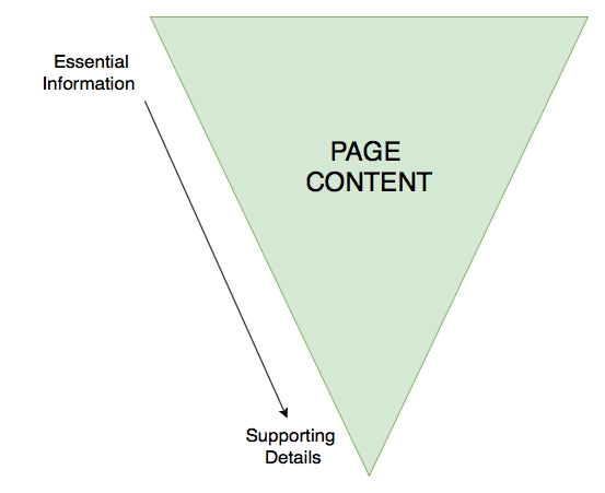
The idea behind the inverted pyramid is to have the most important information “on top” (within your first paragraph), with the details coming in the subsequent paragraphs. Readers often scan pages for information, so by putting the big takeaways early on, you will increase the chances the readers learn the information they need.
Subheadings
Subheadings give the reader a roadmap of your website and are critical for accessibility and screen readers. Using subheadings helps chunk, or compartmentalize, ideas and concepts, while also reinforcing the hierarchy of information. For example, if you have a website heading for “atoms,” and subheadings for “protons,” “neutrons,” and “electrons,” the subheadings reinforce that they are the parts of an atom. It’s important to consider the size of font when making headings, below is the best way to determine it:
- Heading One (H1): The main heading at the top of the page, should be the largest font
- Heading Two (H2): The heading used to separate the content within your main heading, should be larger than your text font, but smaller than H1
- Heading Three (H3): The heading used to make small points/asides, may be the same size as your text font, but bolded or italicized to differentiate from the text
It is worth noting that certain web design platforms (such as Wix, Weebly and Google Sites) automatically set the page title to Heading 1, but you will want to check the settings to confirm this. These platforms often also set the size and style of the headings, so all you need to do is use them!
Language Usage
The most important thing to remember is that writing for the web is different than academic or print writing. You should be using “half the word count (or less) than conventional writing” (Nielson, 1997, para. 3) on a webpage. With less words to communicate the information you want to present on your website, you need to ensure that every word that you use, the tone that you take, and the style of writing you employ increase the readability of your page. Ultimately, the language you choose to use can influence whether a reader explores the content on your site or makes an immediate exit.
Know Your Audience
According to the University of Maryland Baltimore Website Manual (n.d.), “Most users visit a web page for 10-15 seconds. In that brief time, 80 percent will skim the page for keywords they already have in mind. Therefore, before you create content, it’s important to understand your audience and anticipate what content and keywords they’re trying to find” (para. 27).
Are you creating a website for your students? Parents? Colleagues? Administrators? Which words or phrases appeals to each of these groups? What type of tone and language do you use when communicating with each of these groups? You will want to keep this in mind when selecting the word choice and writing style for your website.
Use language that appeals to your audience. For example, if you are designing a website for your students, consider what language you use to capture their attention or give directions, and use this same style of language when creating your website content. Also, use a readability checker to ensure your content is written at a level that is accessible by your audience. By paying close attention to your language usage when designing your website and ensuring it will captivate your audience, you will keep them engaged in your content for longer.
Readability
The majority of Americans read between a sixth and ninth grade level (although your students might be even lower than this). Writing content that is too advanced or takes too long to understand will discourage visitors from exploring your website. Using plain language that is simple, concise, and concrete “removes barriers between you and your readers” (Loranger, 2017, para. 4).
While you may be thinking that using plain language will dumb down the content or lower student achievement, this doesn’t have to be the case. You can still present the information on your site in a professional manner, while also ensuring it’s easy to read or scan. Indeed, using plain language is “welcome by readers; in fact, studies show that it makes the writer look smarter. (If people understand more of what you’re saying, they will likely feel that you make sense.)” (Loranger, 2017, para. 4).
While academic literature is made of long complex sentences and highly specialized vocabulary, studies show that professionals today value content that is “clear and concise” (Loranger, 2017). Modeling this type of language on your website will make it easier for students to access and understand the content.
- Word Choice: Keep your vocabulary simple and make your points as plainly as possible. Prioritize nouns and verbs - use adjectives and adverbs only when necessary. Get rid of unnecessary words (once you have written your content, read it again and see how many words you can delete, then repeat this process).
- Sentences: Your sentences should be short and to the point. Avoid complex sentences. If you need to break up a sentence, a dash is the most effective way to do it. But, it is best to split the sentence in two.
- Paragraphs: Paragraphs should be no longer than five sentences long and should only address the specific heading they are connected to. Any information that strays from the topic will confuse the readers trying to move quickly through your page.

Tone
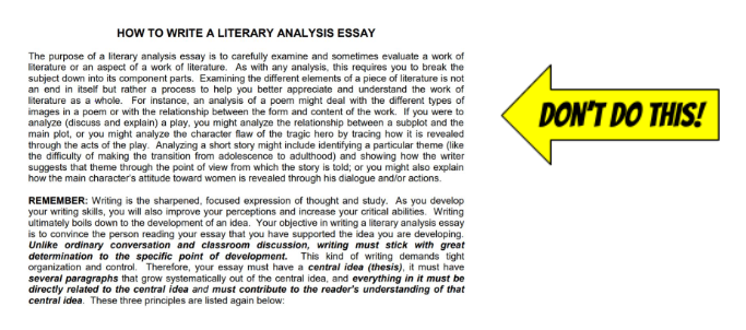
Establishing a rapport with your learners can lead to good learning outcomes. The same is true online. The tone that you take in your writing for the web will determine how your students “hear” you. Keep this in mind and follow these guidelines to establish an appropriate tone:
- Choose a tone that mirrors how you interact with learners in real life.
- Establish a tone that is consistent and appropriate for both age and context.
- Don’t be too rigid. This can be off-putting and offensive (University of Maryland Baltimore, n.d.).
- When it comes to tone, value brevity over voice and stay consistent.
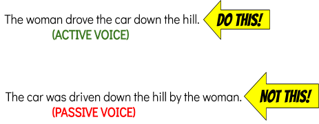
- Write in an active voice and maintain a uniform verb tense throughout your work.
Credibility
As your students scroll through your educational website, they will be evaluating the trustworthiness of your information. The last thing you want is your students questioning whether the content you provide is accurate. The best way to avoid this is simple: Make sure your writing is comprehensive, correct, and current. Use a spell checker! When readers find spelling or grammatical errors on a website, they’re less likely to trust the content. Connect your content to the rest of the internet using links, multimedia, and other resources.
Cite all of your sources - this is not only essential for legal reasons, it’s also an important technique to role model for students. You can decide what type of citation style to use (e.g., MLA, APA, Chicago), just make sure to keep it consistent throughout your entire site. Use quotation marks to indicate any information directly pulled from another source, such as a website, blog, book, or video. Simply providing a link to an article without identifying the author (e.g., source) is not enough to cite borrowed information.
In this article, Bendici (2021) shares that it can be helpful to:
- Avoid acronyms.
- Avoid passive voice.
- Aim for a 8th-9th grade reading level.
- Be clear and concise (re-read your text and remove as many words as you can).
- Include relative pronouns (whom, who, which).
- Not use different words for the same subject.
Writing for a Subject-Specific Website
If you are designing a website to present your students with information and resources related to one or more subject areas, here are a few additional tips to engage your learners with the text on your site.
Keep it Simple and Organized: Limit the amount of information on your website so that your students don’t feel overwhelmed when they visit. Chunk information and resources for sub-topics into separate sub-pages rather trying to feature everything the student needs to learn about a topic on a single page.
Keep Your Content Up To Date: Have you ever scrolled to the bottom of a website to see its copyright date (e.g., Copyright 2013) and then question the credibility of the information on the site since it hasn’t been updated in many years? Your students will do the same thing! Make sure you spend time at least once every few months modifying your site by revising information, adding or removing resources, and featuring related news. By presenting new content for your subject area, you can hook students in and have them stay on your site longer. For example, if you’re designing a social studies website, instead of presenting the same facts about American historical figures, you can add content that usually gets skipped over or left out of history textbooks such as LGBTQ history and notable African-American history. By incorporating interesting new content that appeals to your students, you will be increasing student motivation and engagement.
Create Content that is “Made To Stick”: Heath and Heath (2007) developed a set of guiding principles, called the Made to Stick principles, that can be used to create content that is “sticky,” (i.e., hard to forget). The acronym SUCCESS can help you remember the principles:
- Simple: As mentioned previously, don’t overwhelm the reader. Focus on one key point per paragraph. Omit extra words. Write in a concise and clear manner.
- Unexpected: Present information that surprises the reader.
- Concrete: Make it easy for the reader to see how the content is relevant to their life.
- Credible: Ensure the information you present is current, accurate, and reliable.
- Emotion: Present content in a way that make the readers feel something (e.g., joy, frustration, anger, excitement).
- Story: Tell a story. Storytelling is one of the most powerful techniques for communicating information since people who are reading or listening to a story mentally put themselves in the story, thus making it more memorable.
Chapter Conclusion
If you follow the tips from this chapter, you will be able to fill your website with content that your readers will find engaging, interactive, and memorable. Here is a checklist to help you remember the key points from this chapter:
- Keep your website simple - use white space and plain language.
- Break up large chunks of text.
- Use typographical emphasis (e.g., bold, italics, font size/color) to draw readers’ attention to specific words or phrases.
- Put the most important information at the top of the page (inverted pyramid).
- Use subheadings and sub-pages to chunk and organize information.
- Use language that appeals to your audience.
- Ensure your content is current, credible, and accurate.
- Keep your content up-to-date.
- Employ the Made to Stick principles to engage your website readers.
References
Loranger, H. (2017, October 8). Plain language is for everyone, even experts. Nielsen Norman Group. Retrieved from https://edtechbooks.org/-Kbw
Nielson, Jakob. (1997, October 1). How users read on the web. Nielsen Norman Group. Retrieved from www.nngroup.com/articles/how-users-read-on-the-web/.
University of Maryland Baltimore. (n.d.). Best practices for web writing. Retrieved from https://edtechbooks.org/-Gag