1. Introduction
Outside the visual arts, color is rarely discussed by professionals in systematic ways; among UX and LX designers, color is generally approached in a strange give-and-take between technical prescription and intuitive preference. For instance, the color system outlined in Google’s (n.d.) material design visual language provides precise guidance on how to generate a color palette from your primary color, what to use secondary colors for, and what colors are typical for specific elements (such as error screens), but it does not provide designers any guidance on what primary color to pick in the first place, when to use different types of color palettes (e.g., analogous, complementary, triadic), and why. This is likely because, when designing for a corporate client, designers are generally constrained by the preexisting branding requirements of the client (e.g., “our brand is periwinkle”) and must work from a particular color starting point when making designs.
But designers must also often counterbalance their own and their clients’ everyday assumptions and receive wisdom about color in order to create the best designs for end users and learners. For instance, early in my professional experience creating websites for clients, I delivered a mock-up that I thought looked good and met the client’s requests perfectly. Frustrated with what he saw, the client furrowed his brow and slowly replied, “Yes, but I need something that pops.” This, in turn, frustrated me, because the only explanation he then provided would result in what I thought would be a terrible-looking design. “What does ‘pop’ really mean?” I thought. And “How can I fix the design to be something that the client likes and something that I’m proud of?” And, perhaps most of all, “How can my client and I communicate about color in more meaningful ways?”
Beyond this need for designers to meaningfully communicate with clients, color also plays an important affective and cognitive role in learners’ experiences. Various studies have shown that color-use influences learner attitudes, comprehension, and retention (Gaines & Curry, 2011). Some of these influences are broadly universalizable, others are contextual to the learner’s age, gender, or culture, and others are contextual to the subject matter or learning objectives being targeted. Furthermore, there might be multiple right or useful ways to use color in a particular design project, and inappropriate or ineffective color-use in one project might constitute optimal use in another.
For these reasons, clear and reliable guidance on the what, how, when, and why of color-use in UX design is difficult to come by, and the problem of effective color-use is a prime example of why UX design cannot be approached purely as a science nor as an art but as a craft that synergistically merges the two. Toward this end, I will begin in this chapter by briefly providing some rudimentary groundwork on the underlying physics of color and its technical representation in digital formats. This will give us a common vocabulary for referencing specific aspects of color (e.g., hue vs. tone) as well as some technical knowledge necessary for actually using color in UX design scenarios. After this, I will briefly explore the science of color-use in UX by summarizing some of the emotional, cognitive, and physiological effects that color-use has on learners.
With this backdrop, I will then address some of the applied aspects of color-use that will influence the craft of UX and ongoing research in this area. Specifically, I will explore four guiding considerations of color-use that should be addressed in UX — contrast, attention, meaning, and harmony—and then provide guidance on how to use color schemes to improve harmony by highlighting five dominant types of color schemes. I will then conclude by providing specific craft guidance on using color for UX projects and comment on how this should connect to ongoing UX research.
2. Physics of Color and Technical Use
We must begin this chapter by reviewing some of the physics of light and color. Color is a visual sensation created in the mind of the viewer from differing wavelengths of visible light, ranging from low-frequency reds to high-frequency violets. Some color sensations can be produced by a narrow band of wavelengths, but others are produced as multiple color wavelengths are mixed. For instance, when all color wavelengths are mixed together, they make white light, which is why a dispersive prism can be used to split white light into a rainbow of spectral colors. By putting the primary colors of light together, then, white can be created additively, as in Figure 1, and various other colors not even present in the rainbow can be created by mixing light wavelengths together, such as red and blue making magenta.
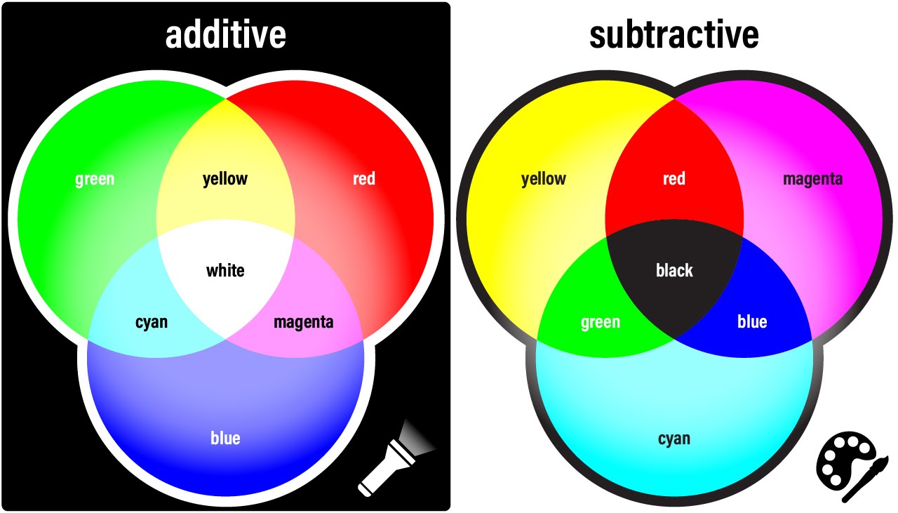 Figure 1
Additive and Subtractive Color Mixing ModelsFor this reason, computer screens and other displays have historically used differing intensities of only three primary colors of light: red, green, and blue (RGB). On screens, RGB dots are used in combination to create colors ranging from white, when they are at full intensity, to black, when they produce no light, and the millions of color combinations in between that are commonly used in movies, games, simulations, images, and websites.
However, visual media that rely upon physical materials to reflect (rather than generate) light, such as ink and paint, operate from a different model of color mixing. Though mixing a green ray of light and a red ray of light would produce yellow light, combining green paint and red paint would produce a dark brown. Such materials rely upon a subtractive color model (cf. Figure 1), wherein black is the sum of all colors and white is the absence of all colors.
Recognizing these two approaches to color mixing is important to understand common notations present in design and authoring software. For instance, when creating a website, video game, mobile app, or illustration, RGB notations are used, such as rgb(255,255,0) for yellow, wherein each number represents a range of 0 (lowest) to 255 (highest) intensity for the primary colors. Hexadecimal notations are also commonly used as a shorthand version of RGB, such as #ffff00, wherein the number ranges are converted to a base-16 number system, ranging from 0 to ff, without losing any information. When creating print media, on the other hand, CMYK notation is commonly used, such as cmyk(0,0,100,0) for yellow, wherein each of the primary colors is represented as a percentage of intensity (0-100%) and black is provided as a fourth color mixin, because true black is difficult to make through mixing (in real-world applications, mixing would only generate dark browns and grays). Table 1 provides some notation examples of common colors.
Table 1
Notation Examples of Common Colors
|
Name
|
|
Additive
|
Subtractive
|
|---|
| |
|
RGB
|
Hexadecimal
|
CMYK
|
|
White
|
|
rgb(255,255,255)
|
#ffffff
|
cmyk(0,0,0,0)
|
|
Black
|
|
rgb(0,0,0)
|
#000000
|
cmyk(0,0,0,100)
|
|
Red
|
|
rgb(255,0,0)
|
#ff0000
|
cmyk(0,100,100,0)
|
|
Green
|
|
rgb(0,255,0)
|
#00ff00
|
cmyk(100,0,100,0)
|
|
Blue
|
|
rgb(0,0,255)
|
#0000ff
|
cmyk(100,100,0,0)
|
|
Yellow
|
|
rgb(255,255,0)
|
#ffff00
|
cmyk(0,0,100,0)
|
|
Cyan
|
|
rgb(0,255,255)
|
#00ffff
|
cmyk(100,0,0,0)
|
|
Magenta
|
|
rgb(255,0,255)
|
#ff00ff
|
cmyk(0,100,0,0)
|
|
Gray
|
|
rgb(127,127,127)
|
#808080
|
cmyk(0,0,0,60)
|
Using any of these notations can generate millions of possible colors, including basic hues of the color wheel, low-saturation tints of hues (by lightening toward white), and low-brightness shades of hues (by darkening toward black), along with various mixtures of tinting and shading (cf. Figure 2). These terms will be important moving forward for understanding research on color effects for the affective domain. Thus, hue represents the color’s position around the color wheel, saturation represents the amount of white mixed with the hue, and brightness represents the amount of black mixed with the hue.
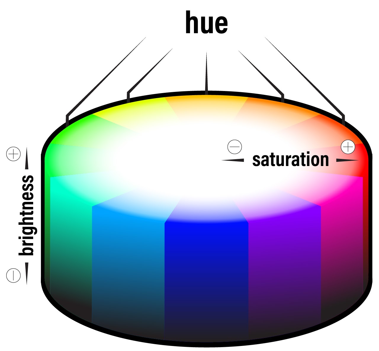 Figure 2
Hue, Saturation, and Brightness on a Color Wheel3. Emotion and Learning
When people see the colors represented by the color wheel, they have various emotional and physiological reactions to them that influence their general experiences and also their learning. Alongside the famous cognitive domain taxonomy, Krathwohl, Bloom, and Masia (1964) also proposed a taxonomy for what they called the affective domain of learning, or the aspects of learning related to “a feeling of tone, an emotion, or a degree of acceptance or rejection” as expressed through goals oriented toward “interests, attitudes, appreciations, values, and emotional sets or biases” (p. 7). Recent years have seen renewed interest in the affective domain as educators and designers have struggled anew with how to support learner self-regulation, motivation, and persistence. Though the connection between color and learning may not be obvious at first, by influencing learner emotion, attitude, and interest, color can influence learner behaviors and attitudes, which in turn will influence their learning.
For instance, one study found that exposure to red prior to taking an IQ test subconsciously impaired performance, presumably by triggering feelings of danger, failure, or avoidance (Elliot et al., 2007). Though such emotional states might have limited direct effects on learning outcomes, they may play an important role in improving intrinsic motivation and the desire to keep working (Heidig et al., 2015); by employing positive emotion cueing, designers can help increase mental effort in the learner, reduce perceived difficulty of the material (Park et al., 2014; Um et al., 2012), and improve learner comprehension (Plass et al., 2014).
Psychological research on the emotional effects of color extends at least back to the 1950s. In their early work, Guilford and Smith (1959) found that, among the spectral colors, people preferred blue and green the most and orange and yellow the least. Subsequent research found that preference for blue, green, and white generally persisted across countries and cultures (Adams & Osgood, 1973). Additionally, some emotional reactions are universal, such as anger, fear, and jealousy being connected to red and black, while other colors, like purple, are more culturally mediated (Hupka et al., 1997) or are influenced by gender (Osgood, 1971). For example, women take slightly more pleasure in bright colors and find highly-saturated colors slightly more psychologically arousing (Valdez & Mehrabian, 1994). Furthermore, even within a single culture, emotional reactions may change somewhat with age, such as childhood feelings of surprise and fear toward green maturing into adult feelings of happiness (e.g., Terwogt & Hoeksma, 1995).
Physiologically, studies have shown that human reactions to color vary by hue, with long-wavelength colors (e.g., reds and yellows) being more arousing (e.g., increased heart rate and respiration) than short-wavelength colors (e.g., blues and greens; Jacobs & Hustmyer, 1974; Wilson, 1966). Additionally, many studies have found that primary hues are preferred to secondary or tertiary hues (Kaya & Epps, 2004) and that all of these are preferred to grays. Some of these reactions can be explained by differences in intensity of photoreceptor stimulation in the eye (e.g., the eye is more sensitive to red), while others likely stem from common environmental experiences, such as associating white with cleanliness and blacks and grays with dirtiness (Valdez & Mehrabian, 1994).
 Figure 3
Four Interface Examples That Cue Differing Behaviors, Trust Levels, Attitudes, etc.For a simple example of how this relates to UX and LX design, consider the password prompt interfaces in Figure 3. If you were presented with each of these interfaces, how might your emotional and behavioral reaction to the prompt differ based upon its color? Seeing a red prompt might make you stop and consider “Is this really a secure site?” On the other hand, an orange prompt might get your attention but be somewhat confusing or concerning, a gray prompt might feel bland but also seem secure or professional, and a blue prompt might make you feel comfortable about entering your information when perhaps you should not be comfortable.
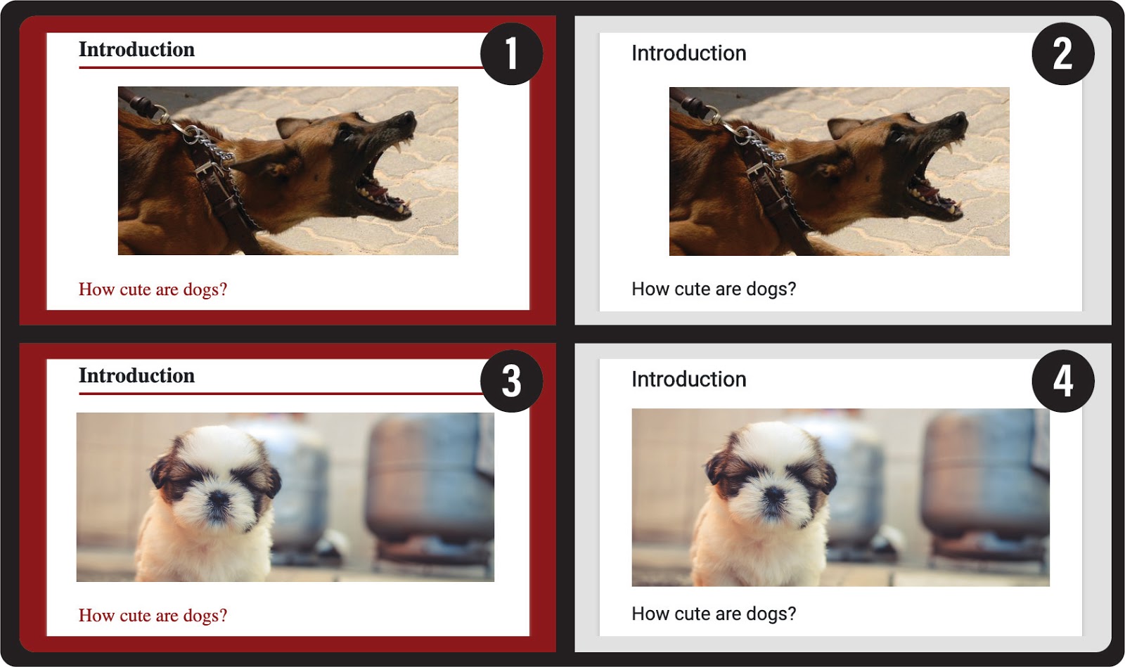 Figure 4
Four Display Options for a Mobile App About Pet Care With Variations on Color and ContentSimilarly, suppose you are designing a learning app for young children on how to responsibly care for pets. In Figure 4, four options are provided. Two use an aggressive image of an adult dog (1, 2), while the other two use an image of a soft puppy (3, 4). Two also use a blood red background (1, 3), while the other two use a neutral grey (2, 4). What might be student affective reactions to each of these and how might it impact their ability to achieve learning objectives related to being a responsible pet owner? Option (1) feels very aggressive both because of the content and the color, while option (3) feels like there is a mismatch between what is shown and how it is presented, thereby evoking conflicting emotions. The neutral grey background for (2) and (4), however, allows the content to convey the emotion. And so, if our objective is for children to have a positive attitude toward pet care, then option (4) would likely be the best.
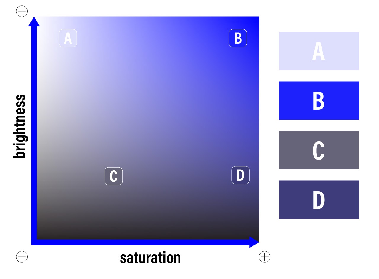 Figure 5
Brightness and Saturation Levels of the Primary Blue Hue With Four ExamplesHue is not the only aspect of color that influences emotion; a color’s saturation (how little white is mixed in with it) and a color’s brightness (how little black is mixed in with it) also has an effect. In research studying color effects on the Pleasure-Arousal-Dominance emotion model (Mehrabian & Russell, 1974), brightness was found to positively impact pleasure and negatively impact arousal and dominance, while saturation positively impacts all three (Valdez & Mehrabian, 1994). So, if using a blue hue, as in Figure 5, you might choose from a variety of brightness and saturation levels, including (a) light blue (high brightness, low saturation), (b) azure (high brightness, high saturation), (c) blueish gray (low brightness, low saturation), or (d) indigo (low brightness, high saturation). Though each of these is a variant of blue, they all elicit different emotional responses in the viewer. For instance, (a) would be fairly pleasurable but not arousing or dominant, eliciting a feeling of tranquility; (b) would be the most pleasurable and somewhat arousing but not dominant, eliciting a feeling of amazement or awe; (c) would be the least pleasurable and fairly neutral for arousal and dominance, eliciting a feeling of boredom; and (d) would be the most arousing and dominant but neutral-positive for pleasure, eliciting more of a feeling of boldness or antagonism (Valdez & Mehrabian, 1994). In fact, brightness and saturation account for two-thirds to three-fourths of the detected variance in users’ feelings toward color (Valdez & Mehrabian, 1994). This means that shifting from soft pink to blood red in a design would likely impact users’ feelings more than shifting from soft pink to soft green or blue.
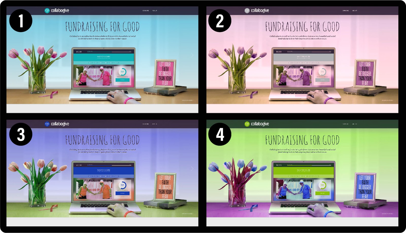 Figure 6
Four Variations of the Same Design That Elicit Different Affective ResponsesIn addition, the context of color-use is important, as in the case of otherwise pleasant colors being used in inappropriate or unnatural ways (Valdez & Mehrabian, 1994). Consider the four variations of the same website design in Figure 6. Which of the four color variations is your favorite? For most people, (1) would likely be the preferred variation, because not only are the colors pleasant but the color-use more appropriately aligns with prior positive experience. In the other examples, the skin color of the hand looks a bit green, which may subconsciously suggest experiences of bodily disease or death to the user; similarly, the stems of the tulips in (4) are red rather than the expected green, which signals to the user that the experience is artificial or unnatural. In such ways, whether intentionally or unintentionally, our designs evoke affective responses; just as (1) might evoke memories of beautiful blue spring days with new life, the others might conversely evoke experiences of sadness, frustration, confusion, or discomfort, all of which will influence a user’s motivation and persistence with using the product.
4. Guiding Considerations
All of this research into the science of color-use is valuable, but how each of us then translates these findings into the actual, embedded craft of UX and LX design is a different matter. For this reason, a few considerations may be useful for guiding any color-use in UX and LX projects, including attending to contrast, attention, meaning, and harmony.
4.1. Contrast
First, ensuring high contrast is important in all designs for aesthetics but is especially important in those that use text. It is also a legal requirement for many UX projects to meet minimum accessibility expectations in many countries, such as those stipulated in the W3C’s Web Content Accessibility Guidelines (WCAG) 2.0. Contrast problems are widespread in learning products. In fact, a recent study on K-12 school website accessibility across the U.S. found that contrast errors were the most common type of error among all sites (Kimmons & Smith, 2019). Contrast errors arise because, though two similarly-saturated colors, such as crimson and blue, may look quite different to most viewers, when superimposed (as in Figure 7) they can become difficult to decipher from one another. As a simple check of this, colored designs can be converted to grayscale to allow you to quickly see how similar the colors are to one another, or an automated contrast checker like the one provided by WebAIM can be helpful. To solve contrast problems, white and extremely light tints should be used to contrast highly-saturated colors, and black and dark grays should be used to contrast light tints.
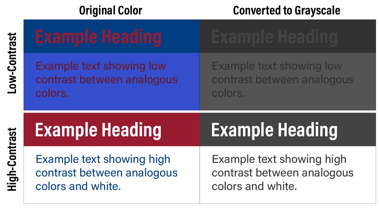 Figure 7
Low-Contrast and High-Contrast Examples of Analogous Color-use With Grayscale Conversions4.2. Attention
Second, colors can be used to quickly and efficiently draw the attention of the eye to visual elements that matter. For instance, one eye-tracking study found that adding random colors to word labels on a grayscale figure moderately improved learner retention and transfer performance by improving the efficiency by which learners could differentiate textual elements (Ozcelik et al., 2009). On an app or VR interface, this might mean using a vibrant color only to effectively draw the learner’s attention to a few important elements, such as commonly-used buttons or interactive elements necessary for progression. Similar principles are often applied to print media, with color only being applied to text in the case of headings, key terms, or blockquote elements. Any variation in color will generally draw the eye of the learner to the variation, and this means that UX designers should use this principle to intentionally draw user attention to elements that matter and avoid unnecessary color variation in elements that are less important. It also means that color cues can effectively be used as guideposts for directing the learner through progressive elements and to influence user pathways in desired ways.
4.3. Meaning
Third, because color conveys emotional (and sometimes even conceptual) meaning to learners, colors should be used in a manner that synergistically emphasizes the intended meaning conveyed by the overall project and individual content elements. As with the pet care mobile app example in Figure 4, improperly using color can subvert intended meaning or set a tone that is either unhelpful, dissonant, or repulsive for learners. As mentioned early, actual meaning and affective influences of color can be complicated, contextual, and individual, but some influences are fairly universal, such as grays denoting lack of importance; warm colors evoking passion, dissent, or engagement; cool colors evoking comfort, closeness, or agreement; and so forth.
4.4. Harmony
And fourth, to use colors well in any design effort, the designer must not only understand the emotions elicited by each color itself but also understand how to use colors together in harmonious ways that meet the intended purposes of the project. For instance, it is common knowledge that warm (low-wavelength) colors draw more attention than cool (high-wavelength) colors and that highly saturated colors draw more attention than washed-out tints, but the mark of a skilled designer is knowing both (a) which colors to use and (b) how to use varieties of colors together in harmonious and intentional ways.
 Figure 8
Two Websites Using the Same Colors but in Different WaysEven when two products use the exact same colors (as in Figure 8), how the colors are used in relation to one another will influence the learner’s affective experience. So, though both 8.1 and 8.2 use the same colors, 8.1 might feel cool, inviting, and professional, while 8.2 might feel comical, distracting, and amateurish.
As a rule of thumb, many designers propose following what is called the 60-30-10 rule, which is commonly used in many other visual fields such as interior design. According to this rule, you should choose a primary color to dominate 60% of the field of view, followed by a secondary color for 30%, and an accent or tertiary color for no more than 10%. For most UX products, this would mean choosing a subdued color as the primary color (such as the soft blue in Figure 6.1 or the white in 8.1), a vibrant color as the accent color (such as the pink in Figure 6.1 or the “Google” primary colors in 8.1), and some variation in between as the secondary color (such as the brown in Figure 6.1 or the grays in 8.1).
5. Color Schemes
To promote color harmony, and to implement the other guiding considerations mentioned above, most designers will begin color-use in a project by developing what is called a color scheme. In most cases, color schemes include between two and six colors that will be drawn upon in intentional ways. Common color scheme types include: (a) monochromatic, (b) analogous, (c) complementary, (d) complex, and (e) achromatic. Each type has its own strengths and weaknesses as well as design considerations to attend to, which I will now explain. For each type, an example image will also be provided, which has the five scheme colors depicted on the right of the image and the color wheel placements of each scheme depicted on the bottom-right.
5.1. Monochromatic
Monochromatic schemes (from mono meaning one and chroma meaning color) utilize a single, dominant color and provide color variation only by using desaturated versions (or tints) of the dominant color. Since they rely on a single color, monochromatic schemes are easy to use in complicated designs to provide a sense of cohesion and uniformity. Because the overall scheme is simple (i.e., one color), this also allows you to include richer secondary elements, such as images in a Facebook news feed or a variety of images on a Pinterest board. The trade-off, however, is that monochromatic designs can be boring or overbearing if highly-saturated versions of the dominant color are overused. To prevent this, use plenty of white and very lightly-saturated tints of the dominant color to offset the more highly-saturated attention areas. In the provided example (Figure 9), the navigation bars are a highly-saturated blue, so the content on the rest of the design needs to use plenty of white and very light blues for balancing.
 Figure 9
Monochromatic Schemes Use a Single Dominant Color of Different Saturations5.2. Analogous
Analogous schemes rely upon two or more nearby colors on the color wheel, generally spanning no more than one-third of the color wheel (e.g., red and blue, green and orange, cyan and violet). Since the colors are not distinct enough from one another to allow them to be placed side-by-side, plenty of white space should be used to separate instances of the two colors. Analogous schemes are more visually interesting than monochromatic schemes, because they provide more color variation, but they are also more difficult to use, because the two dominant colors must be well-separated, and any other visual elements should fit the scheme. In the provided example (Figure 10), the crimson logo and carousel are clearly separated from the blue events block, and the image in the carousel has a dominant blue color (via the woman’s sweater) that roughly matches the other blues in the design. If the woman’s sweater was orange or green, however, the design would struggle to be harmonious; because the design is already using so much color complexity, any more complexity introduced by the secondary elements would be distracting. Because their colors are so close to each other on the color wheel, analogous color schemes in particular may introduce contrast problems.
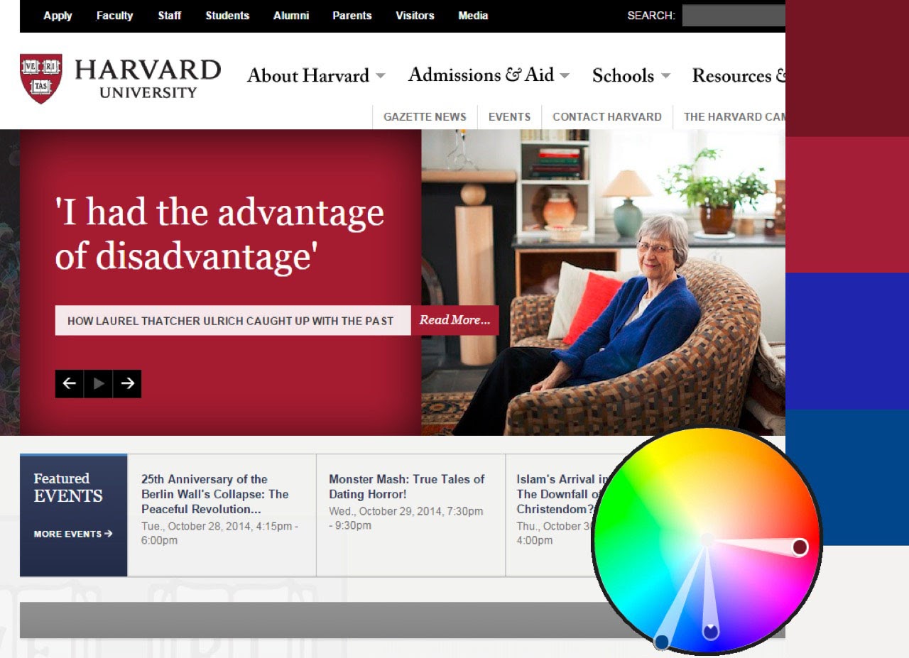 Figure 10
Analogous Schemes Use Two Dominant Colors Less Than One-Third of the Distance on the Color Wheel From One Another5.3. Complementary
The color wheel is conceived as circular rather than linear, because colors on opposite sides when (additively) mixed will make white. These are called complementary colors (cf. Figure 11). Complementary schemes, then, use two dominant colors that are on opposite sides of the color wheel, such as blue and gold, orange and cyan, or pink and green.
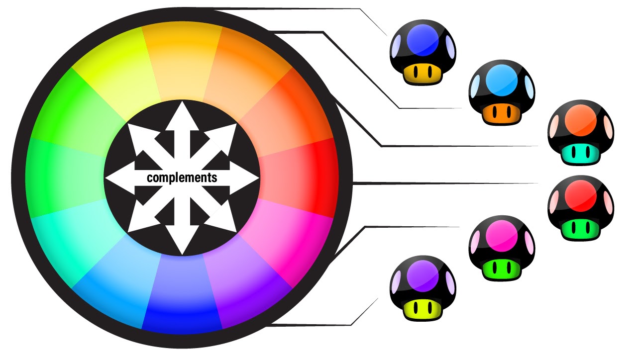 Figure 11
Complementary Colors Reside Opposite One Another on the Color WheelComplementary schemes are also visually interesting, but the dominant colors are distinct enough from one another that they can be used in closer proximity than can analogous colors. In the provided example (Figure 12), the orange logo and thin horizontal bars are placed nicely beside or on top of the dark blues of the menu. However, though the two colors complement each other, one should be treated as the visually dominant color, and the other should be treated as the accent (in this case, the orange is the accent). Typically, the cooler color is used as the visually dominant color, and the warmer color is used as the accent. This allows for the design to show interesting variation while also using the accent color to draw the viewer’s attention to specific parts of the design, such as the logo, buttons, or content separators.
 Figure 12
Complementary Schemes Use Two Dominant Colors on Opposite Sides of the Color Wheel From One Another5.4. Complex
As the name suggests, complex schemes are the most complicated, because they use three or more dominant colors equally situated around the color wheel (e.g., blue, orange, red, and green). Because they use so much color variation, the visual space that the color takes up in the design should be very small and offset with plenty of white space. In the provided example (Figure 13), the website uses a large logo with four very different colors but offsets this by using little to no color in the rest of the design. Because of their variation, complex schemes can be very bright and interesting but can quickly become overpowering if the visual footprint of any of the colors becomes too pronounced (as in Figure 8.2).
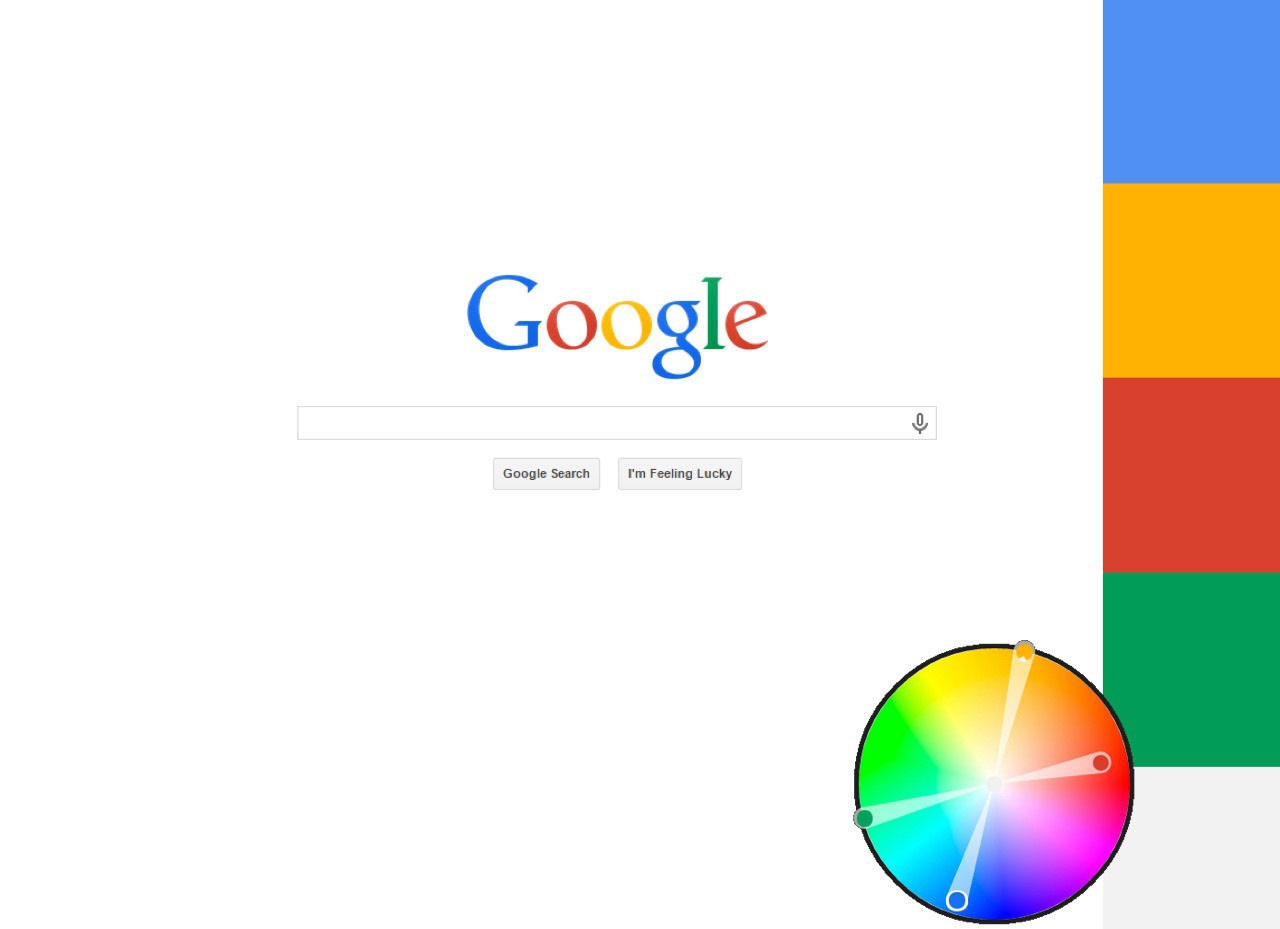 Figure 13
Complex Schemes Use Three or More Colors Equally Situated Around the Color Wheel From One Another5.5. Achromatic
Achromatic color schemes (meaning no color) use only variations on black, white, and gray. Of all the schemes, this scheme is the easiest to use but can also be the least interesting, because it provides the least color variation. Sometimes, however, less design complexity is desirable. In the provided example (Figure 14), the overall site design uses an achromatic scheme so that when colors are used in secondary elements they will draw the attention of the viewer (in this case, products that the vendor is seeking to sell are provided in full color, while menu items and logos are muted grays). Achromatic schemes may be helpful if secondary elements are complex and rich, but without these secondary elements, the design itself would be visually boring.
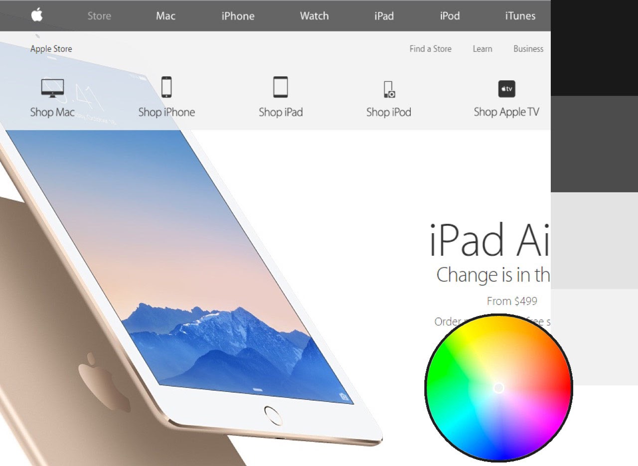 Figure 14
Achromatic Schemes Use Only Black, White, and Grays5.6. Choice and Use
Various tools are available to designers that provide color scheme examples, such as the Adobe Color website or the Google Material Palette Generator, and there are many different ways to create a color scheme. For our purposes, however, I will offer two simple techniques to create professional-looking color schemes that anyone can follow.
The first approach is to start with a single, dominant color that matches your overall emotional objective for your product—blues might be calming or sad, greens might be fresh or healthy, yellows might be fun or playful, reds might be outrageous or dangerous, etc. However, this decision might already have been made for you via institutional branding or logo decisions. Once you have this color, plug the color into a color scheming tool such as Adobe Color, and use the provided radio buttons to switch between color scheme types (e.g., analogous, monochromatic, complementary). If you want a simpler, safer design, go with a monochromatic type, and drag the circles on the color wheel to various saturation levels to give you sufficient variation in the five-color scheme. If you want something more interesting, try the complementary or analogous type. In the case of analogous, you can drag the circles around the color wheel to increase color variation, but the colors generally should not extend more than one-third (120-degrees) the circumference of the circle, lest the variation be too great. In the example image (Figure 15), I started with the Twitter logo blue (#00bbff) and found that an orange hue (#ff8400) might serve as a nice accent (complementary) color.
 Figure 15
Choosing Different Color Scheme Types in Adobe Color From a Single Dominant ColorThe second approach is to choose a picture or painting that you enjoy (preferably of a natural setting) that you feel exemplifies the emotional state you want to create with your design. Then, upload the image to Adobe Color via the “Extract from an image” feature. This will attempt to identify the dominant colors in the picture and to situate them in relation to one another in a harmonious manner. Once imported, you can click back on the color wheel to see where the colors fall and to switch between color scheme types. In the provided example (Figure 16), the image of trees in autumn generated an analogous color scheme of oranges, yellows, greens, and burnt orange.
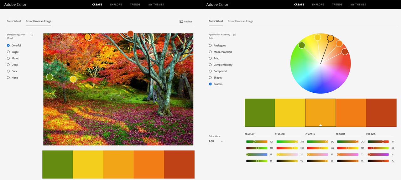 Figure 16
Extracting a Color Scheme in Adobe Color From an Existing ImageOnce you have created a color scheme you are happy with, you can import the color scheme into other applications in a variety of ways. The simplest and most versatile method, however, is to simply take a screenshot and place it into your authoring tool or to manually transfer the hexadecimal codes.
6. Conclusion
This chapter has provided an overview of (a) the physics and technical notations for color, (b) scholarly literature on the relationships between color, emotion, and learning, (c) some guiding considerations on how to use color in UX design, and (d) concrete information on effectively using color schemes to improve harmony and contrast in designs. Some major takeaways for designers should include the following:
- Choose dominant colors that will influence emotions aligning with your intended design goals.
- Use colors in ways that are intentional (e.g., accentuating important content) and natural or appropriate by drawing upon users’ prior experiences.
- Ensure that color contrast is sufficient and that color is used strategically to allow learners to clearly and readily identify important content and follow intended user pathways.
- Choose a color scheme that counterbalances the complexity of your content (complex content requires a simpler color scheme, while simpler content can use a more complex color scheme).
- Use whitespace and white, black, or gray text to increase contrast and to balance color-use.
By following these suggestions, UX and LX designers can create designs that increase motivation and persistence by making user experiences more pleasing, more intentional, and less frustrating.
From a research perspective, much work is still needed to help designers better understand issues of contextual color-use, differential affective influences on learners, and interactions between various colors as well as between color, content, and objectives. Because effective color-use in UX design is best described as craft (or synergy between science and art) and because learning contexts vary so greatly, it is reasonable that the most important research in this area moving forward will focus on applied, focused uses of color through iterative design cases and continual improvement. Though UX designers might not have the same obsession with color that Monet expressed, hopefully our obsession for learning will help us to more fully recognize that color is an important aspect of the learner’s experience that should be better understood and more skillfully applied.
References
Adams, F. M., & Osgood, C. E. (1973). A cross-cultural study of the affective meanings of color. Journal of Cross-Cultural Psychology, 4(2), 135–156.
Elliot, A. J., Maier, M. A., Moller, A. C., Friedman, R., & Meinhardt, J. (2007). Color and psychological functioning: The effect of red on performance attainment. Journal of Experimental Psychology: General, 136(1), 154–168.
Gaines, K. S., & Curry, Z. D. (2011). The inclusive classroom: The effects of color on learning and behavior. Journal of Family & Consumer Sciences Education, 29(1), 46–57.
Google. (n.d.). The color system. Material Design. https://edtechbooks.org/-Cqk
Guilford, J. P., & Smith, P. C. (1959). A system of color preferences. American Journal of Psychology, 72, 487–502.
Heidig, S., Müller, J., & Reichelt, M. (2015). Emotional design in multimedia learning: Differentiation on relevant design features and their effects on emotions and learning. Computers in Human Behavior, 44, 81–95.
Hupka, R. B., Zaleski, Z., Otto, J., Reidl, L., & Tarabrina, N. V. (1997). The colors of anger, envy, fear, and jealousy: A cross-cultural study. Journal of Cross-Cultural Psychology, 28(2), 156–171.
Jacobs, K. W., & Hustmyer, F. E. (1974). Effects of four psychological primary colors on GSR, heart rate, and respiration rate. Perceptual and Motor Skills, 38, 763–766.
Kaya, N., & Epps, H. H. (2004). Relationship between color and emotion: A study of college students. College Student Journal, 38(3), 396–405.
Kimmons, R., & Smith, J. (2019). Accessibility in mind? A nationwide study of K-12 websites in the U.S. First Monday, 24(2). https://edtechbooks.org/-pRn
Krathwohl, D. R., Bloom, B. S., & Masia, B. (1964). A taxonomy of educational objectives — Handbook II: Affective domain. David McKay Company, Inc.
Mehrabian, A., & Russell, J. A. (1974). An approach to environmental psychology. MIT Press.
Osgood, C. E. (1971). Exploration in semantic space: A personal diary 1. Journal of Social Issues, 27(4), 5–64.
Park, B., Plass, J. L., & Brünken, R. (2014). Cognitive and affective processes in multimedia learning. Learning and Instruction, 29, 125–127.
Plass, J. L., Heidig, S., Hayward, E. O., Homer, B. D., & Um, E. (2014). Emotional design in multimedia learning: Effects of shape and color on affect and learning. Learning and Instruction, 29, 128–140.
Terwogt, M. M., & Hoeksma, J. B. (1995). Colors and emotions: Preferences and combinations. The Journal of General Psychology, 122(1), 5–17.
Um, E., Plass, J. L., Hayward, E. O., & Homer, B. D. (2012). Emotional design in multimedia learning. Journal of Educational Psychology, 104(2), 485–498.
Valdez, P., & Mehrabian, A. (1994). Effects of color on emotions. Journal of Experimental Psychology: General, 123(4), 394–409.
Wilson, G. D. (1966). Arousal properties of red versus green. Perceptual and Motor Skills, 23, 942–949.